Let's Break Down How to Find That Perfect Gift – Our UX Case Study!
A gift isn't just an object; it's a whole story!
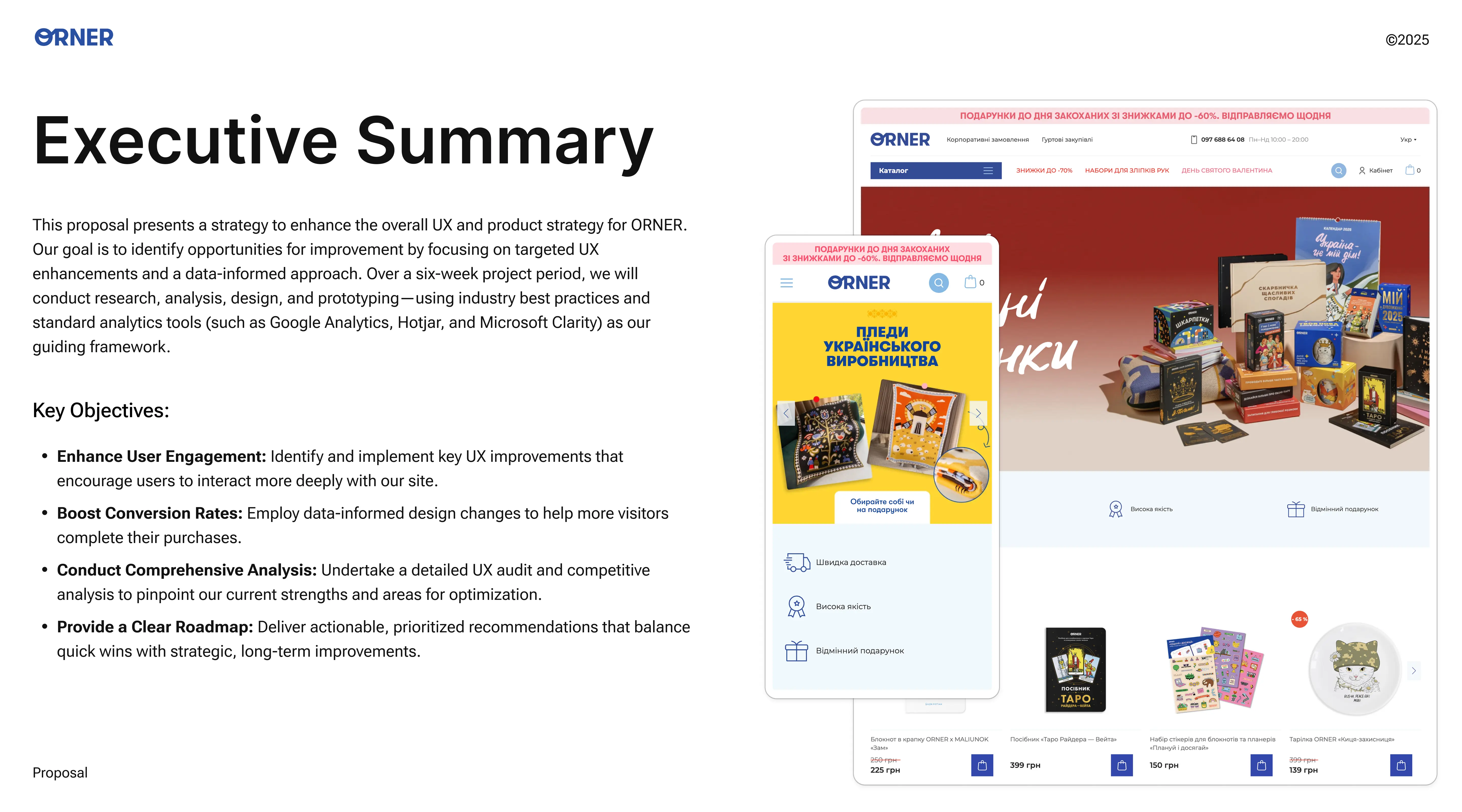
Finding a gift that makes someone go "WOW! 🤯"—that's a real quest, isn't it? Especially now, with so much stuff everywhere. Well, I jumped right into that adventure when I started working on a project for Orner, a super cool Ukrainian brand with tons of gifts and awesome things for the home. Long story short, this project became a real chance for me to level up my skills as a UX researcher and product designer, all on a live business, not just some theory. This all happened during the UX Design Middle course at Projector. There, along with three amazing female designers – Angelina, Yulia, and Katya – I had the honor of helping Orner make their website even more user-friendly and intuitive.
Orner, you know, isn't just some store. It's a brand with a soul! They genuinely want to give people emotions, they create unique Ukrainian products, and their whole vibe is about making life's important moments even brighter. But, as they say, with great power comes great responsibility... Just kidding! It’s just that when your product range grows like crazy (and Orner's was exploding – from tableware to board games and Tarot cards!), and your customers become more diverse, the website needs a little fine-tuning. So our team (Team #2, by the way) dove into this challenging but mega-interesting task with full enthusiasm!
THE CHALLENGE
Between Festive Emotion and Pragmatic Search – Shaping the Project Vision
Our adventure kicked off with a meeting with Vitaliy from Orner. He's the guy who heads up all things digital marketing there. He talked about his brand with so much passion that we were instantly fired up! Orner has been on the market for 11+ years, constantly innovating, launching new product categories (like 3-5 a month, can you imagine!), and most importantly, they really want their customers to have an amazing experience, whether they're buying something or just browsing.
The key "head-scratchers" we identified together became our action plan:
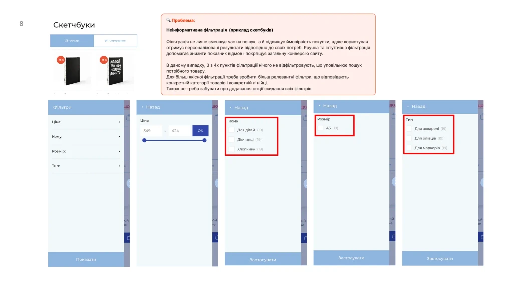
Some products were getting "lost": Even though people were interested in board games, Tarot cards, and sketchbooks (we could see this from site searches and page views), they weren't buying them much. We needed to figure out what the deal was.
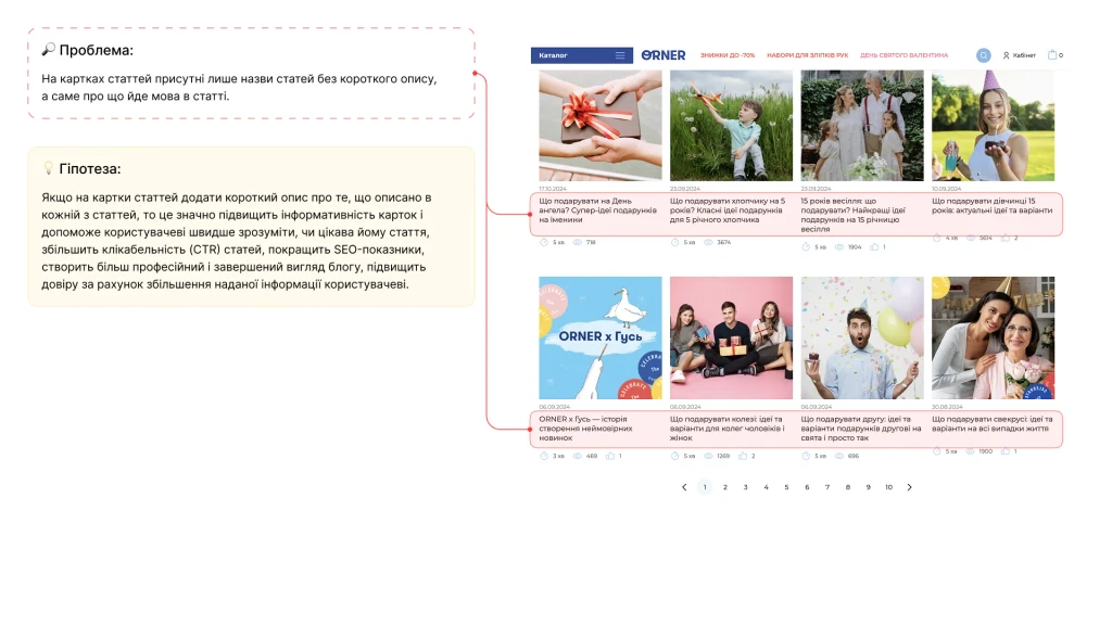
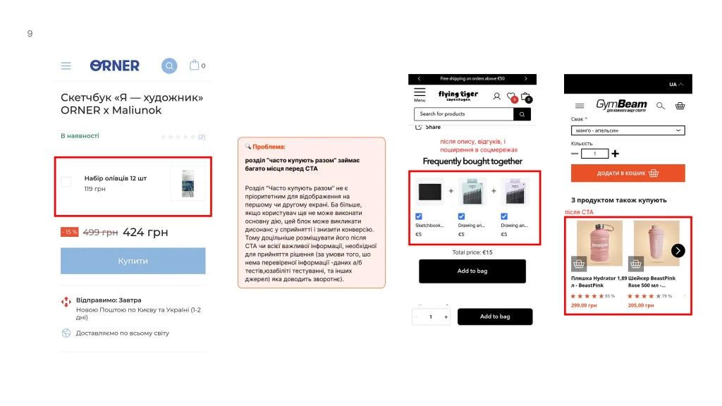
"One size fits all" isn't always a good fit: A standard product page template, no matter how good, couldn't always capture the unique essence of some of the more niche items. Especially when you looked at how specialized stores were doing it.
Preserving the brand's "magic": The last thing we wanted was to improve the site but make it dry and boring, like... well, you get the picture. Vitaliy put it perfectly: "I don't want us to be like Rozetka... People come here for a gift, for an emotion!" And that's 100% true!
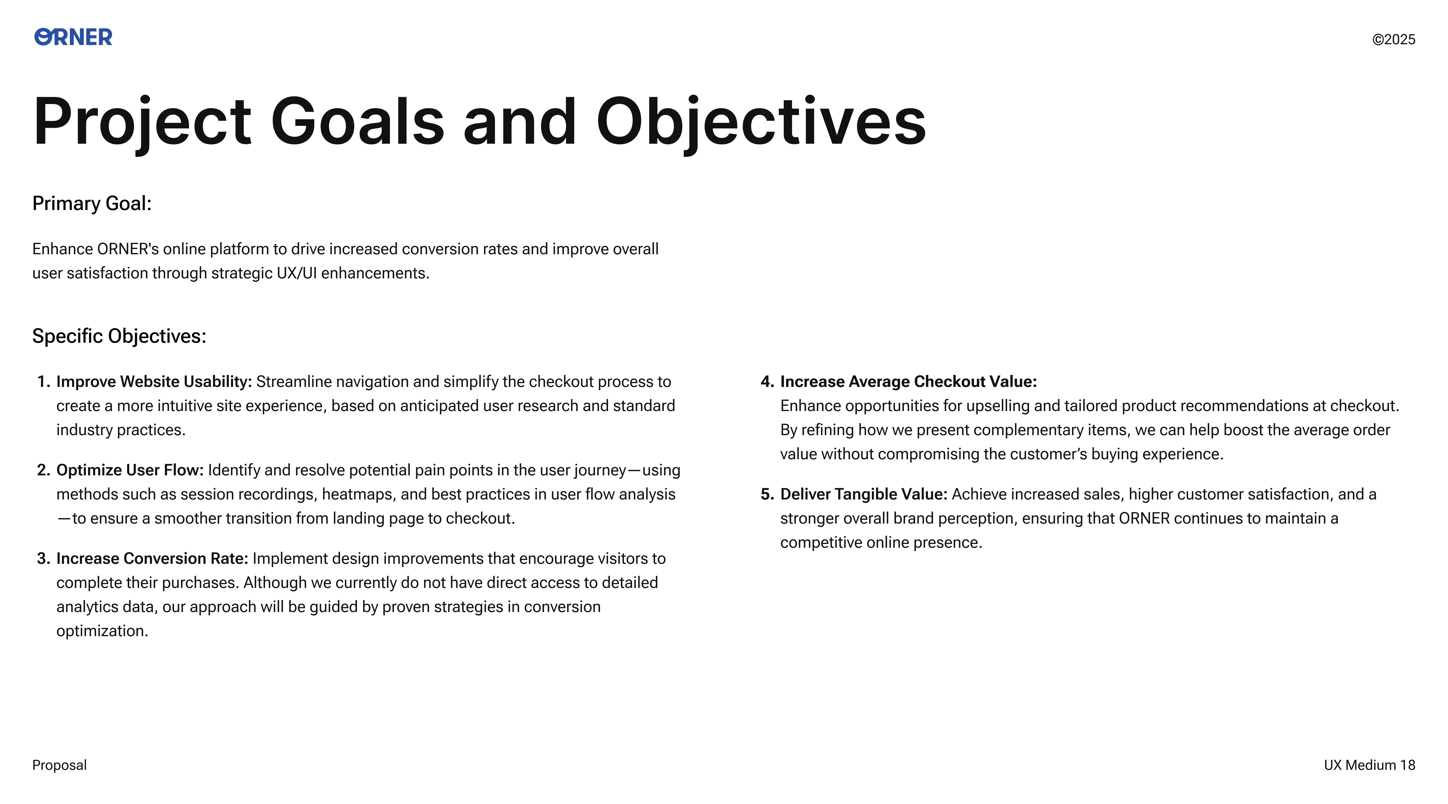
So, our main quest became this: get inside our users' heads, find those "hidden reefs" that were stopping them from making a purchase, and come up with design solutions that would not only make it easier to find gifts but also turn them into true Orner fans!
THE DEEP DIVE
Digging Deeper, or How We Hunted for Treasure in Data and Conversations
You know, when you're facing tasks like these, the first thing you do is roll up your sleeves and start digging! My experience as a design lead and a UX/UI guy in various fields (from crypto to e-commerce) helped me organize the whole process so we wouldn't miss anything important.
Initial Proposal: Even before the official start, our team sketched out a rough draft of what we planned to do. We just took a look at the Orner site and brainstormed potential areas for improvement. This helped us come to the client meeting with something already in hand.
Proposal
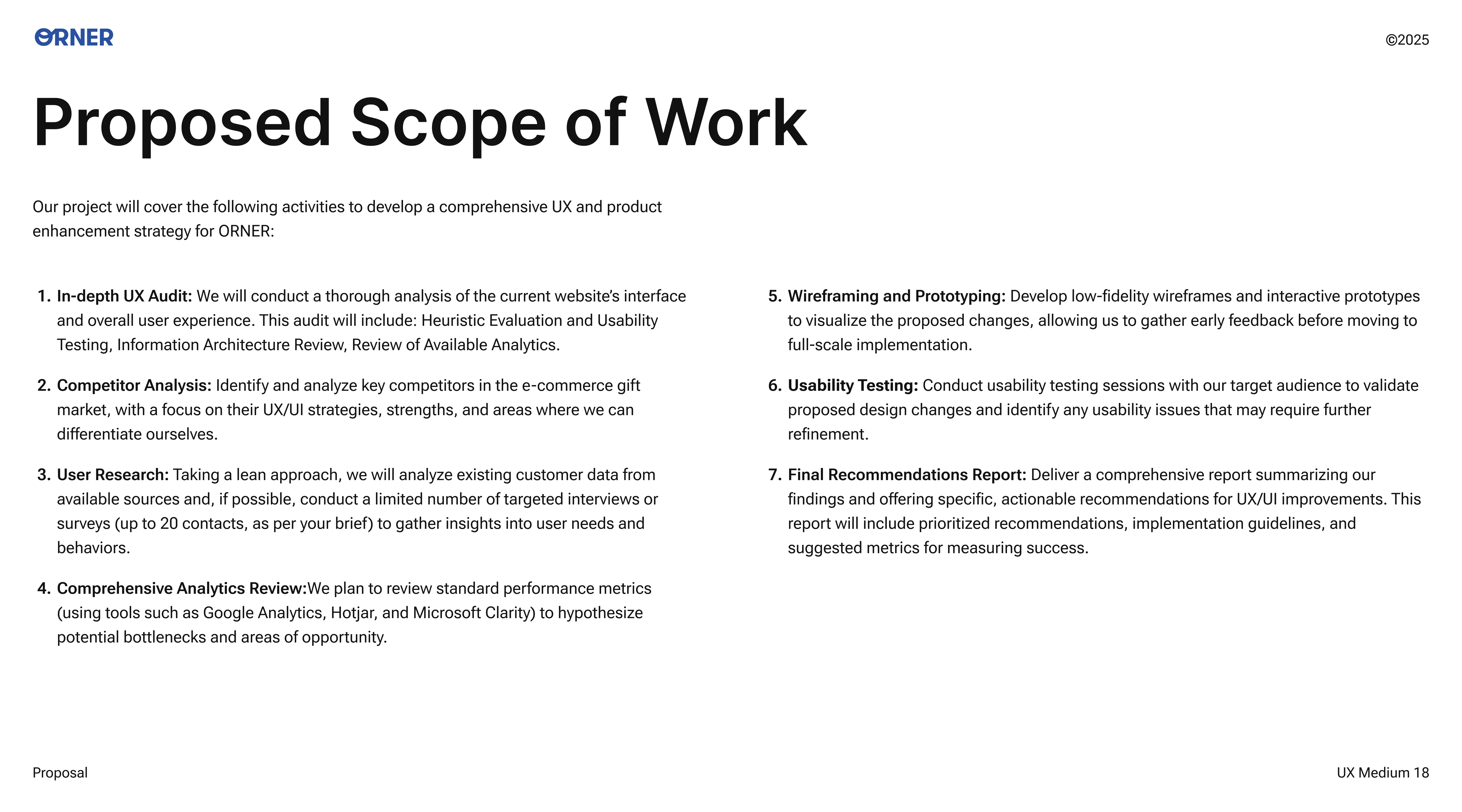
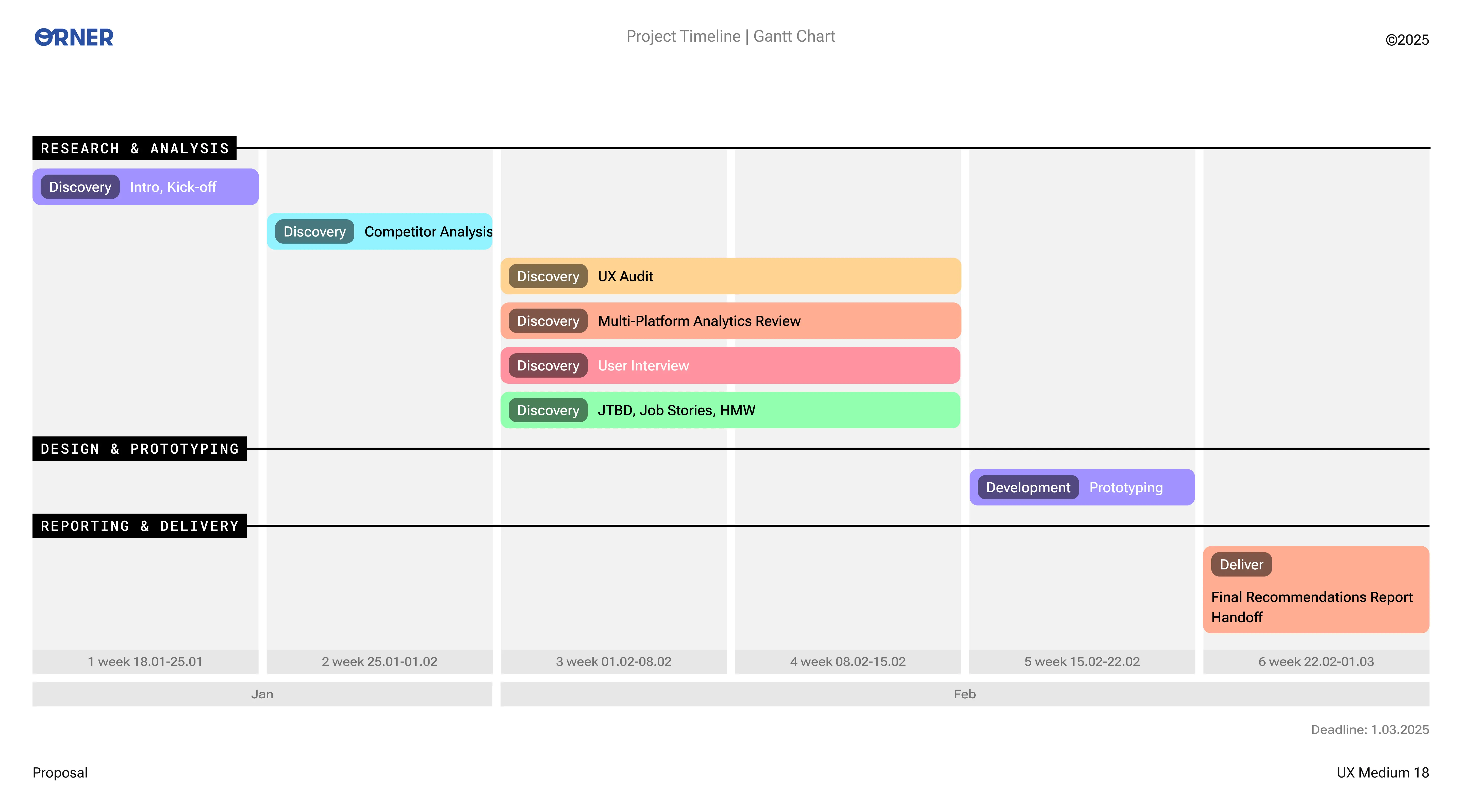
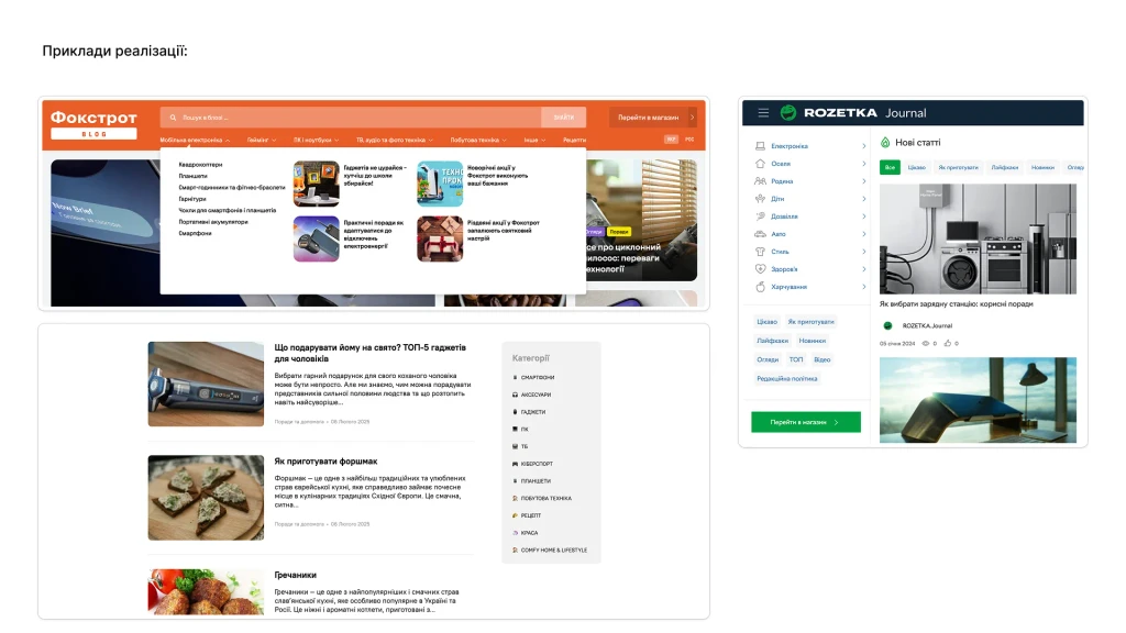
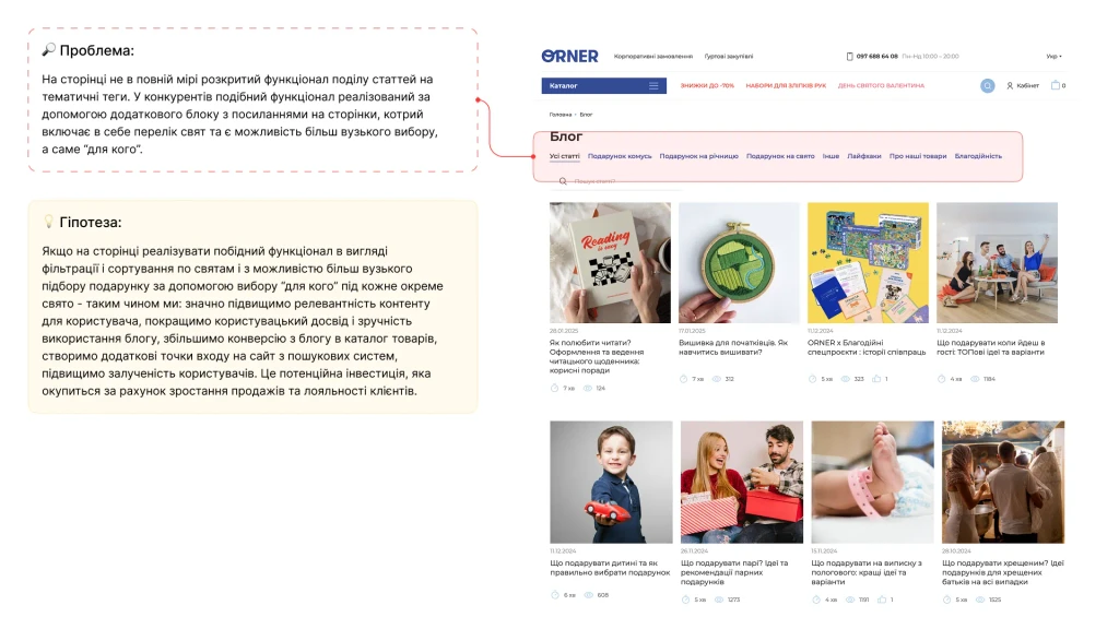
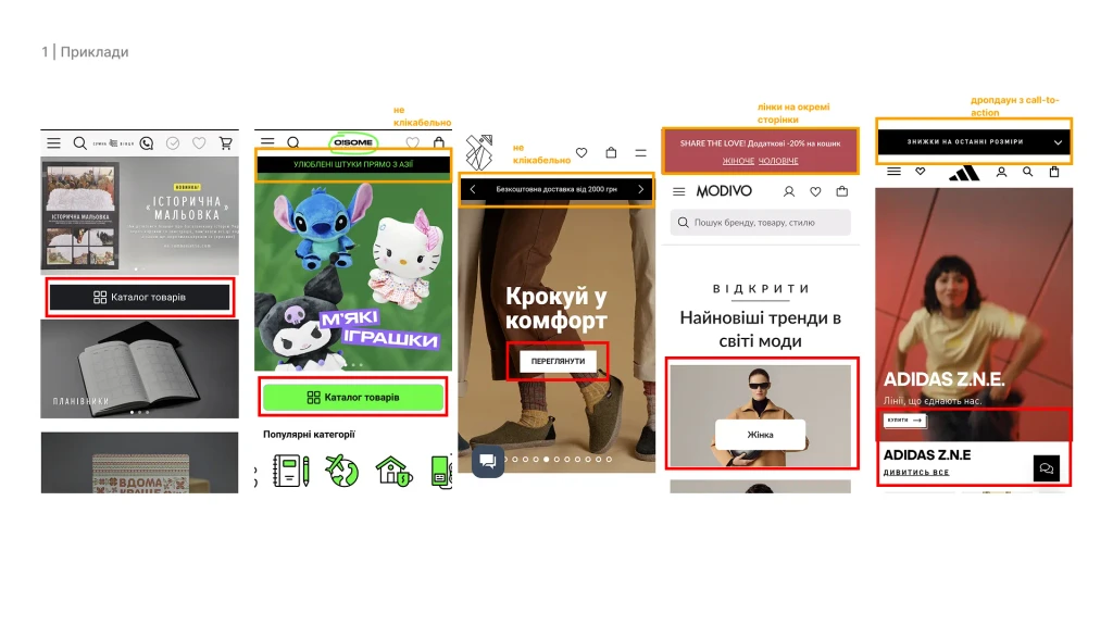
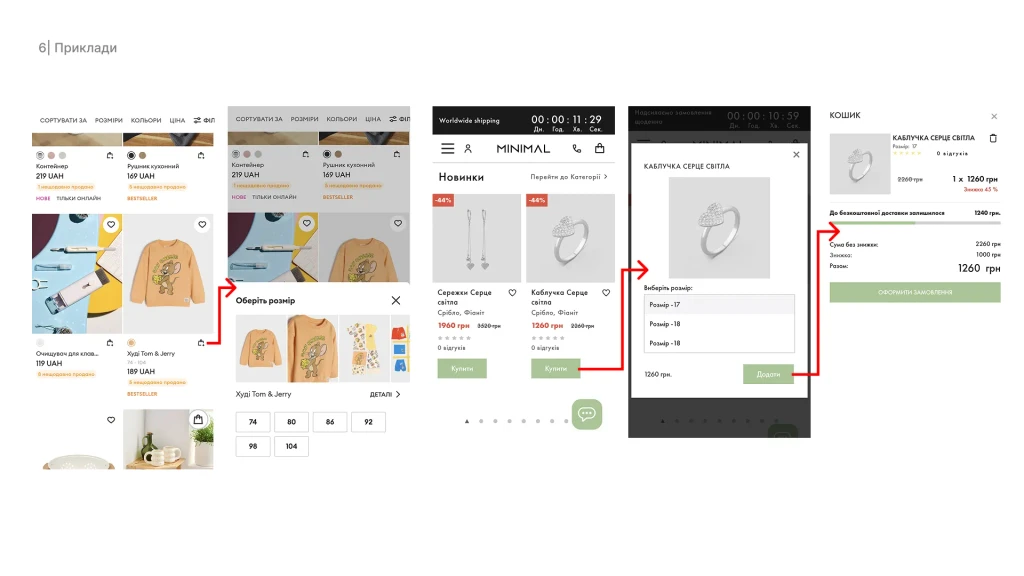
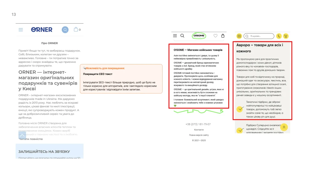
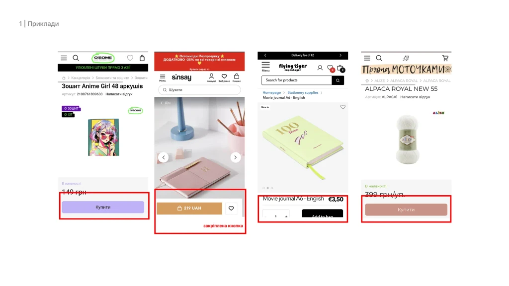
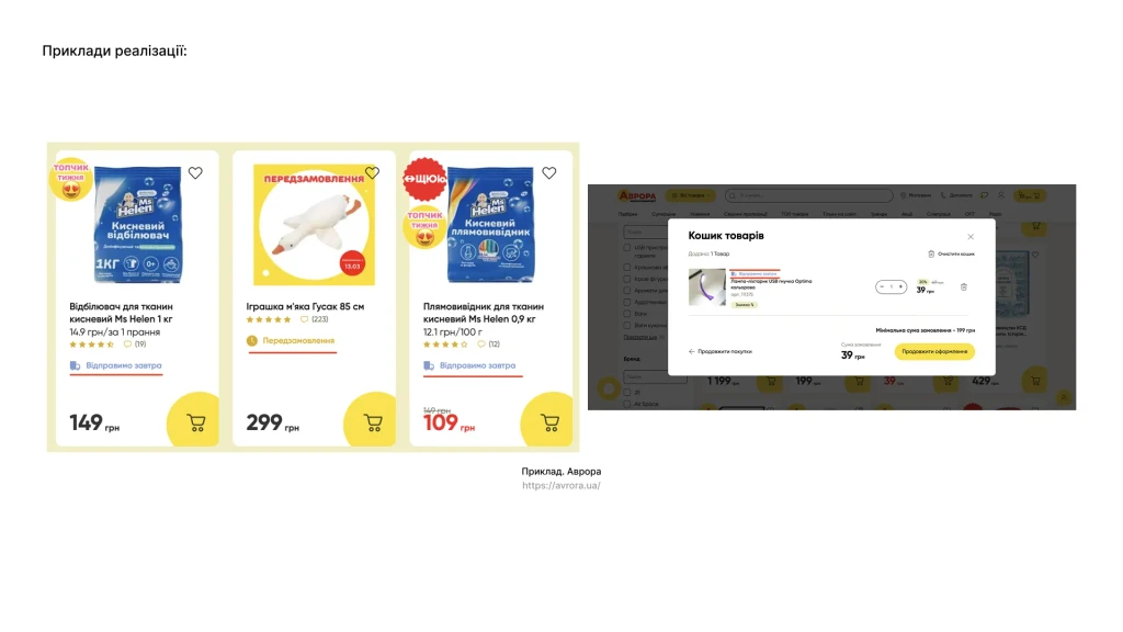
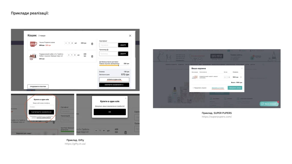
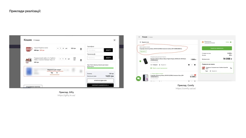
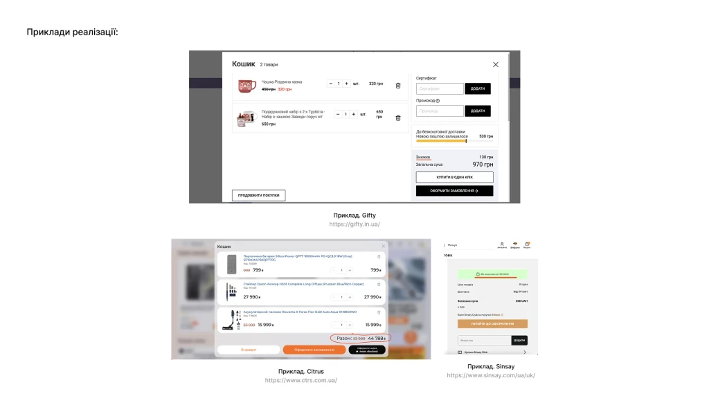
What are the neighbors up to? (Competitive Analysis): Next, we went to check out the competition. And not just other gift shops, but also stores specializing in board games or Tarot cards. This gave us a ton of food for thought: what Orner was already doing great, where they could improve, and what tricks others were using to make their products look more appealing.
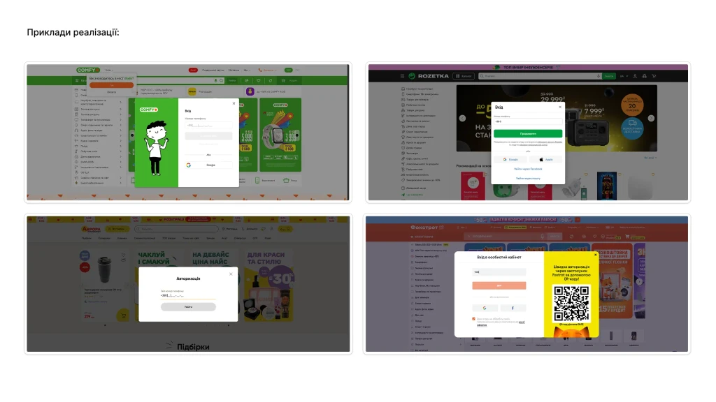
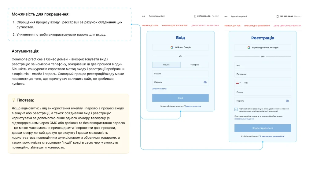
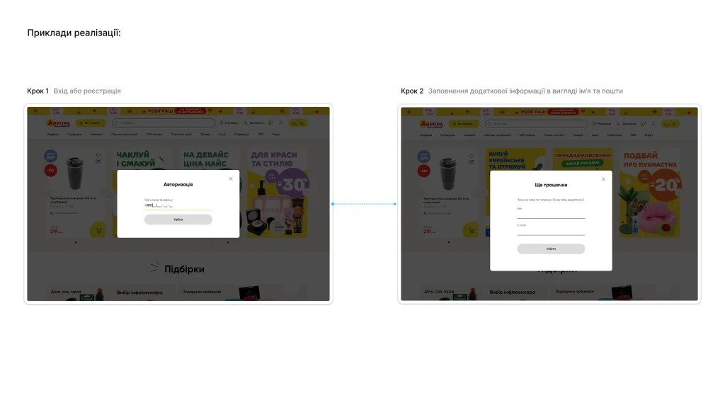
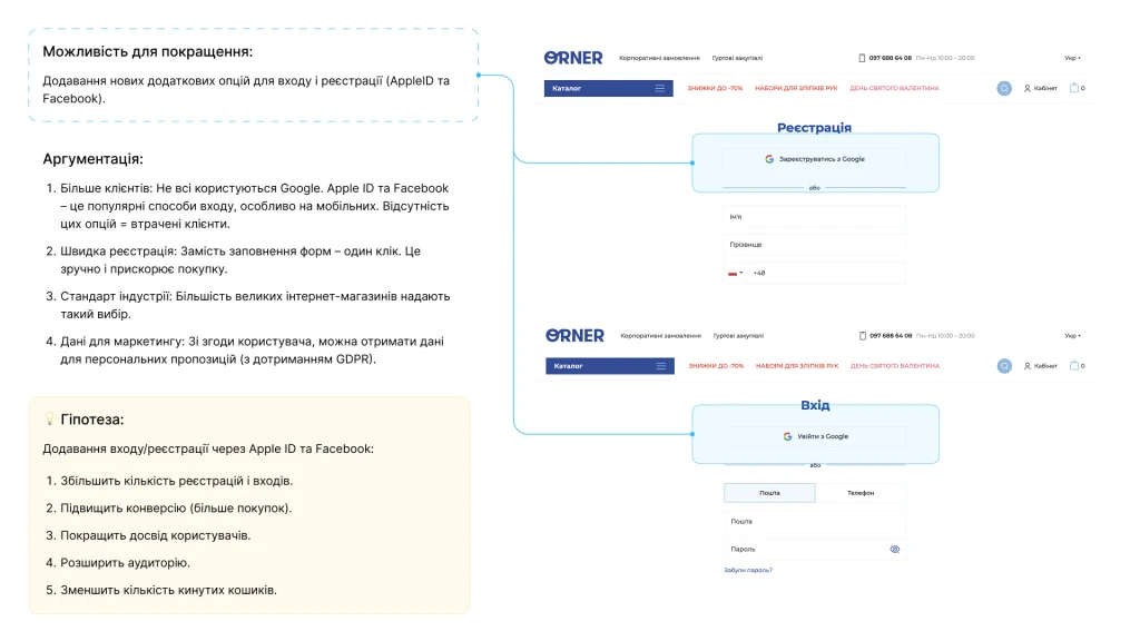
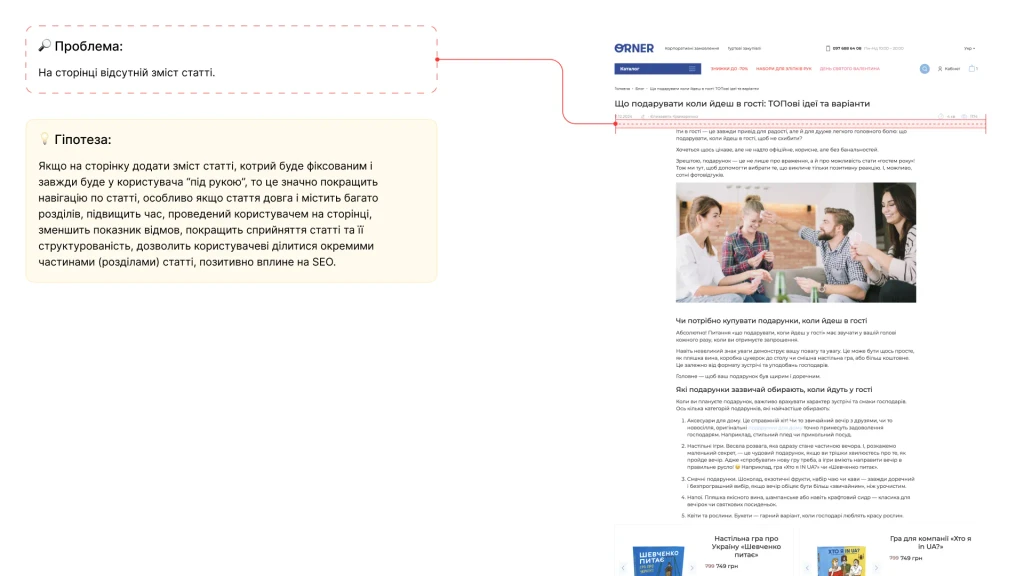
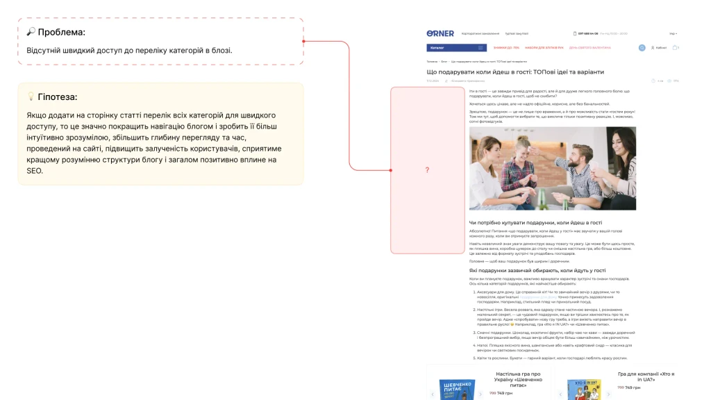
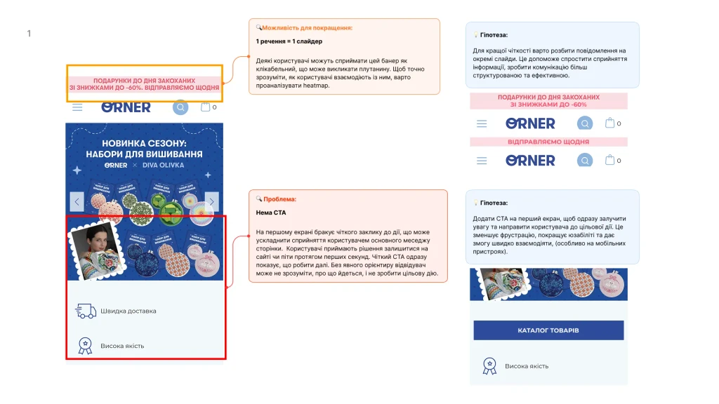
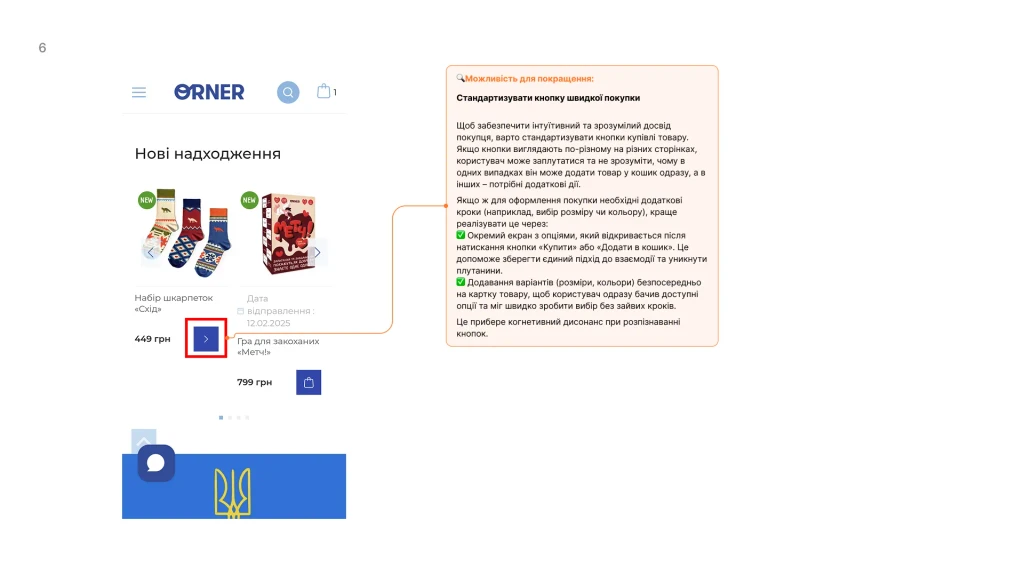
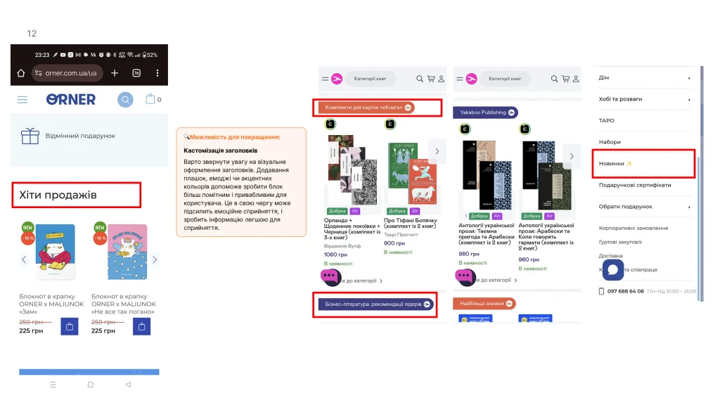
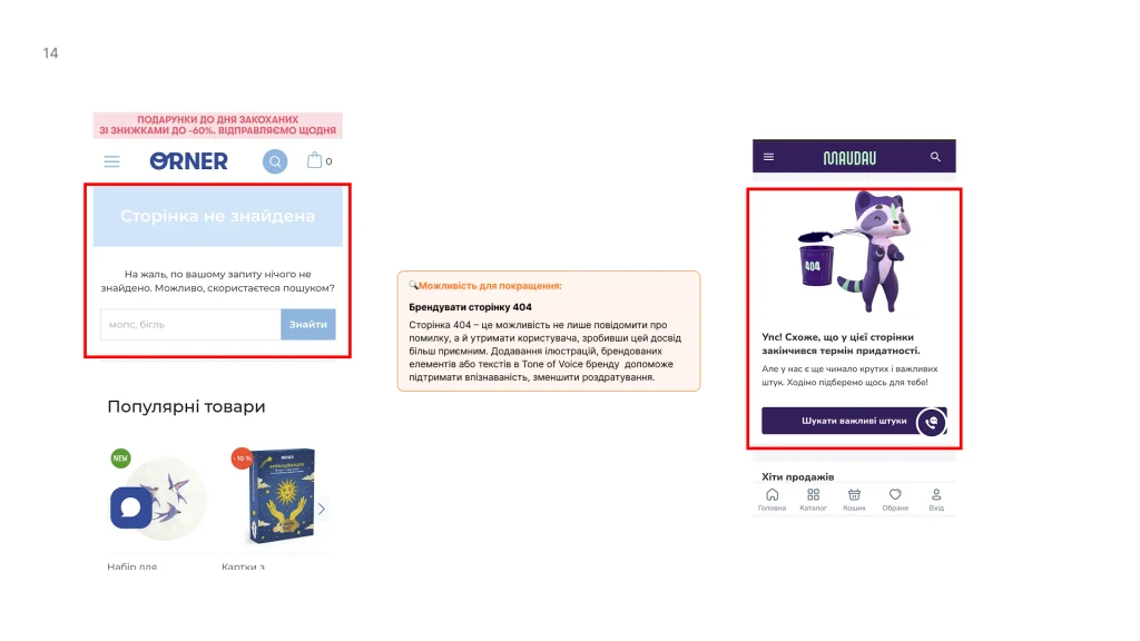
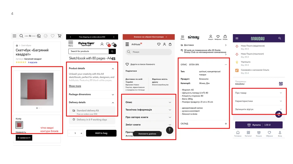
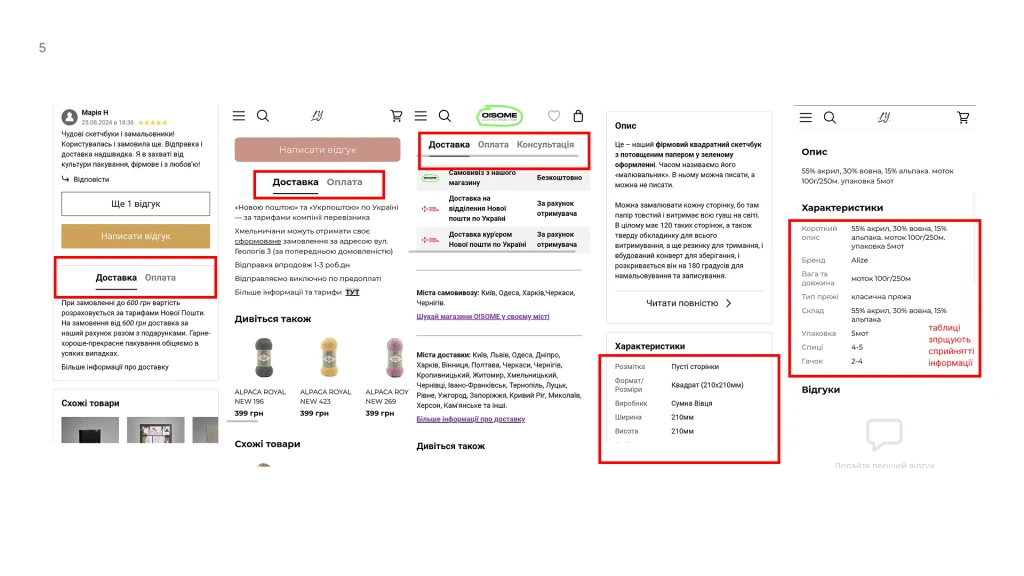
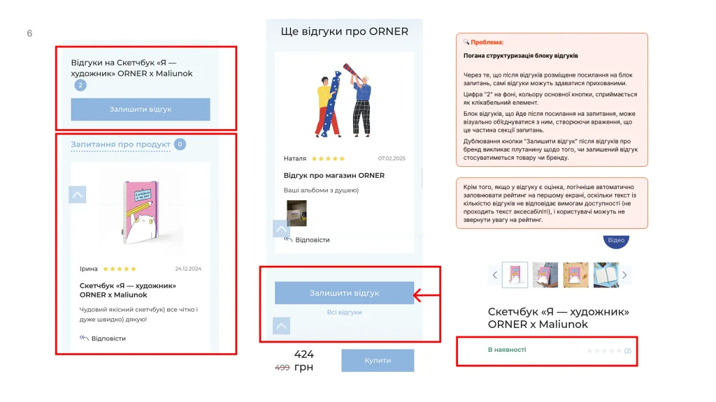
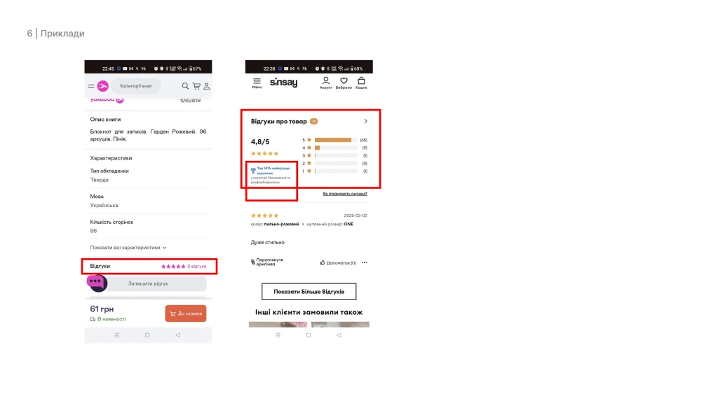
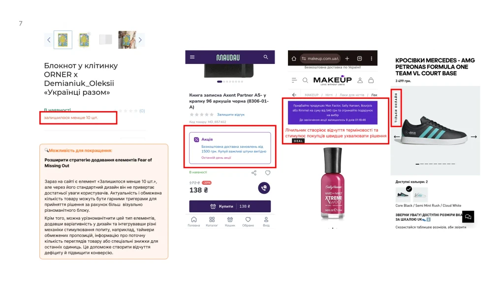
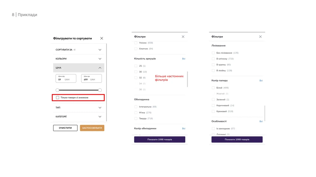
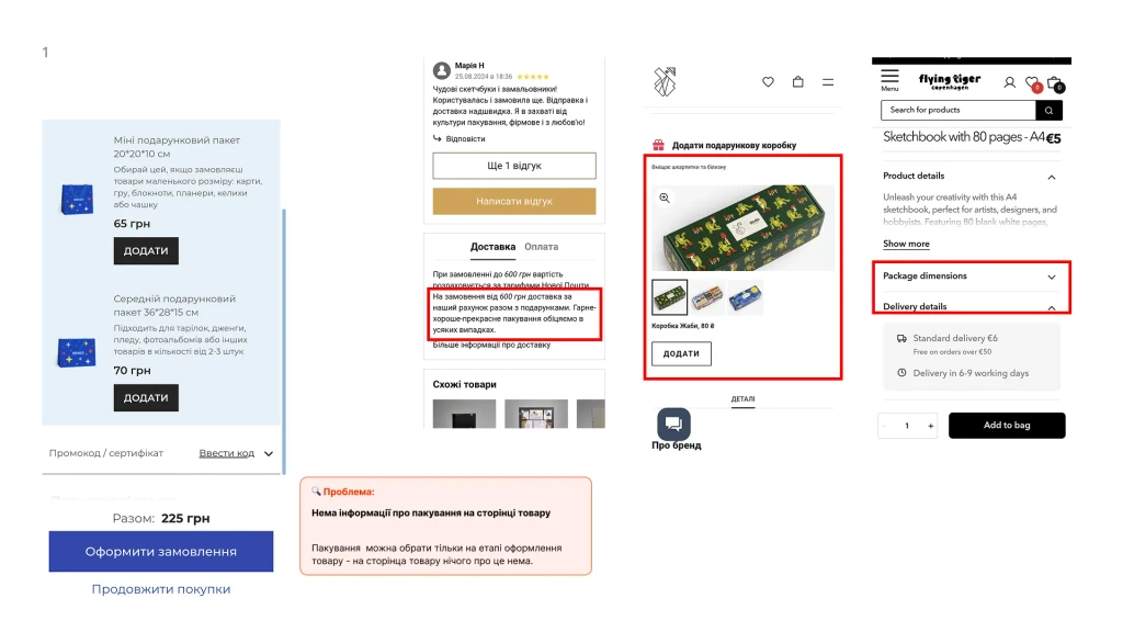
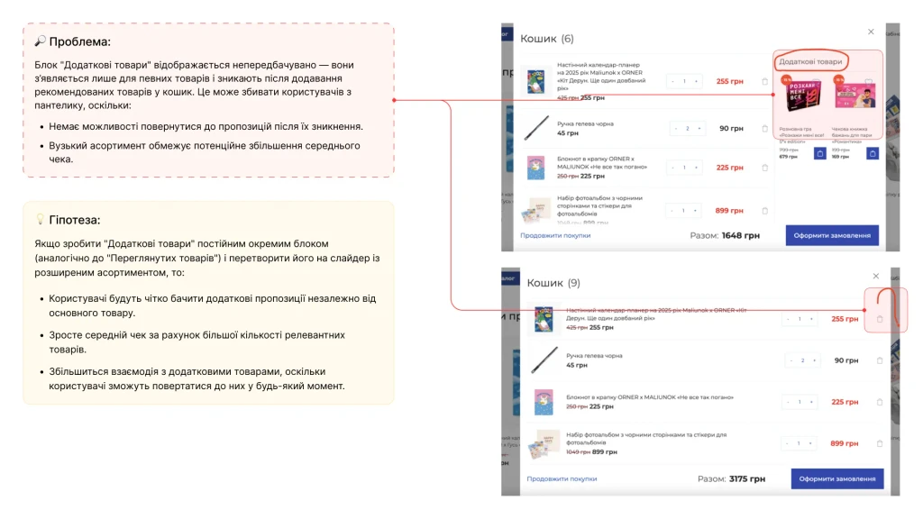
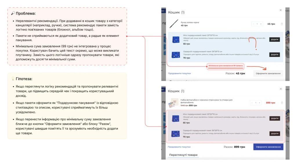
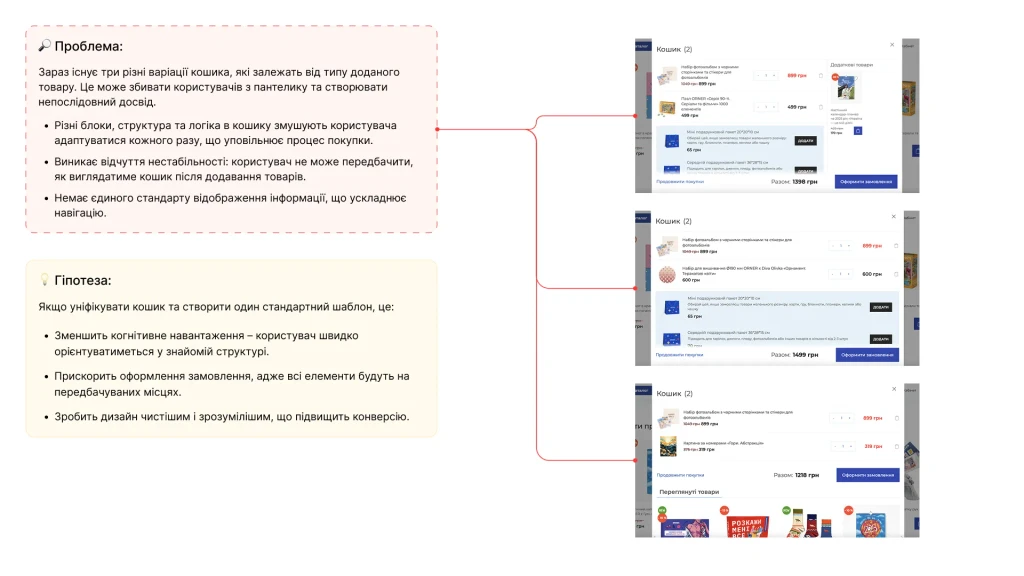
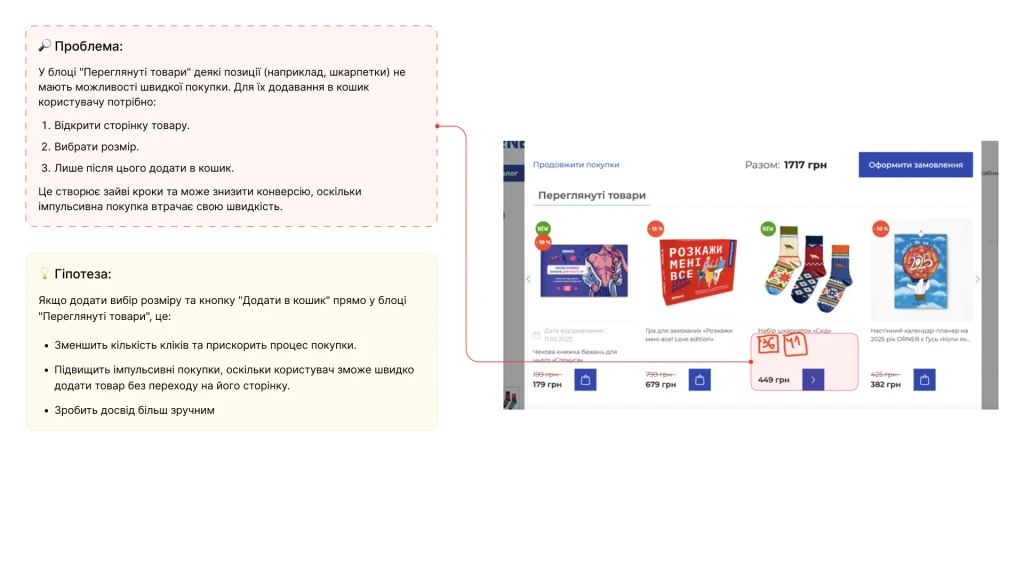
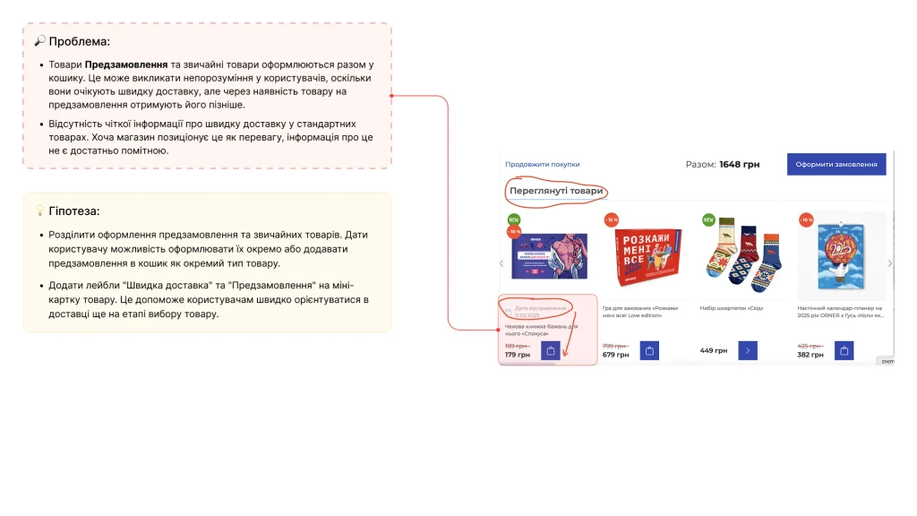
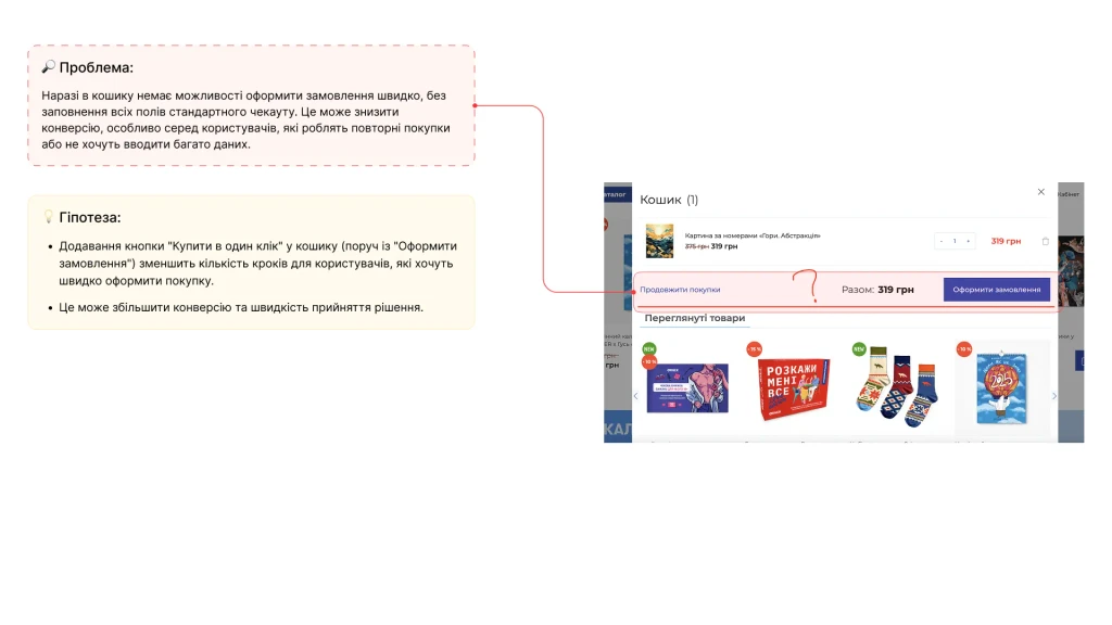
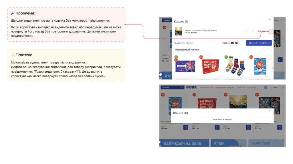
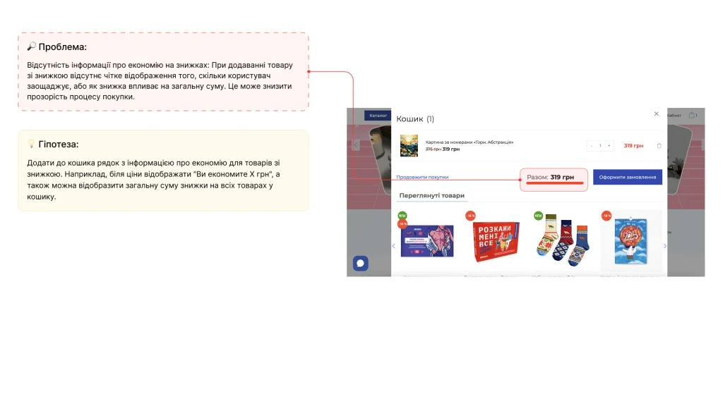
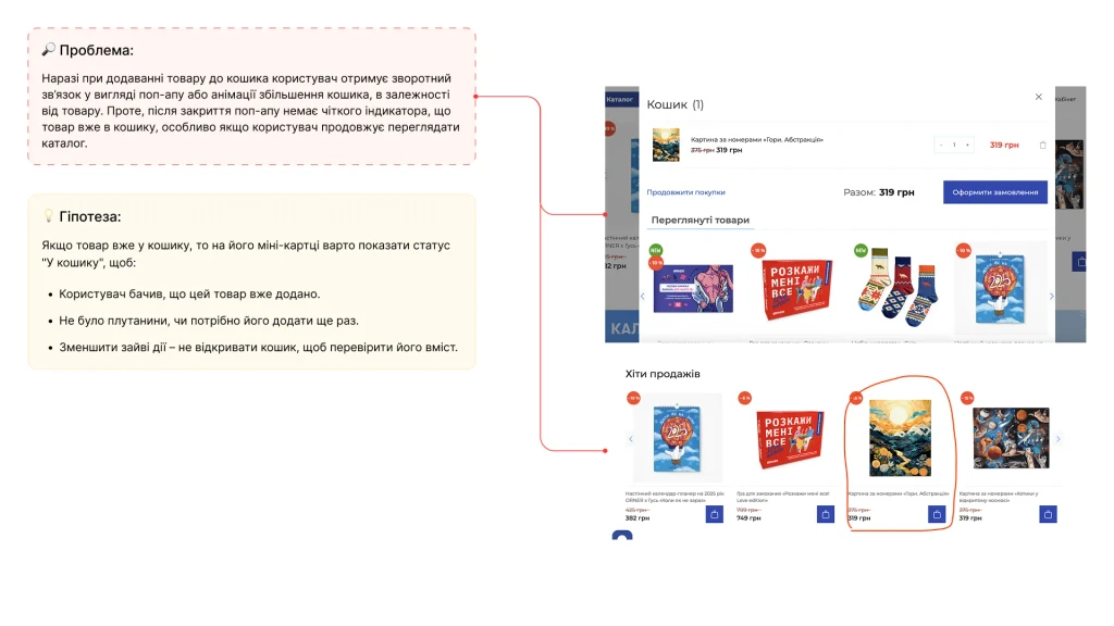
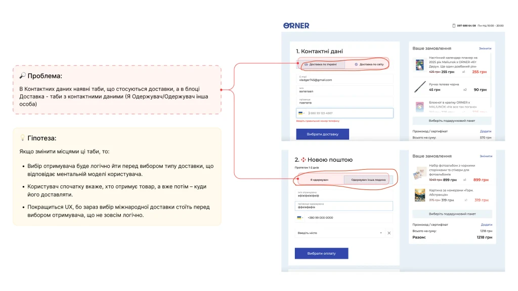
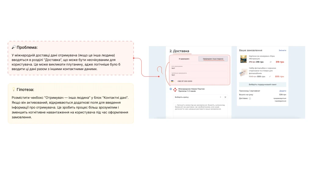
The Site Under a Magnifying Glass (UX Audit): Then, we got down to the Orner site itself. We went through all the key pages: homepage, categories, product pages, blog, cart, checkout, registration/login. And let me tell you, we found some interesting stuff! In some places, the navigation was a maze, some buttons were confusing, and the info in the cart was laid out in a way that was hard to decipher. In short, there was a mountain of work to do!
UX Audit:
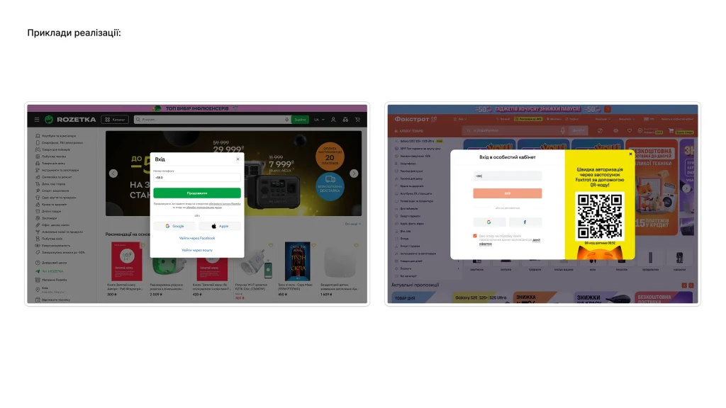
Sign in/out
UX Audit:
Blog
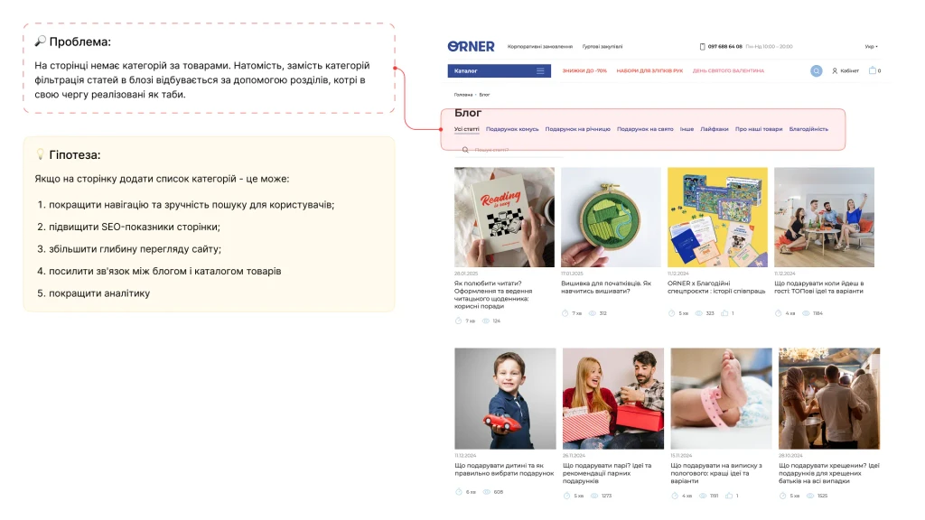
UX Audit:
Blog / Article
UX Audit:
Main Page
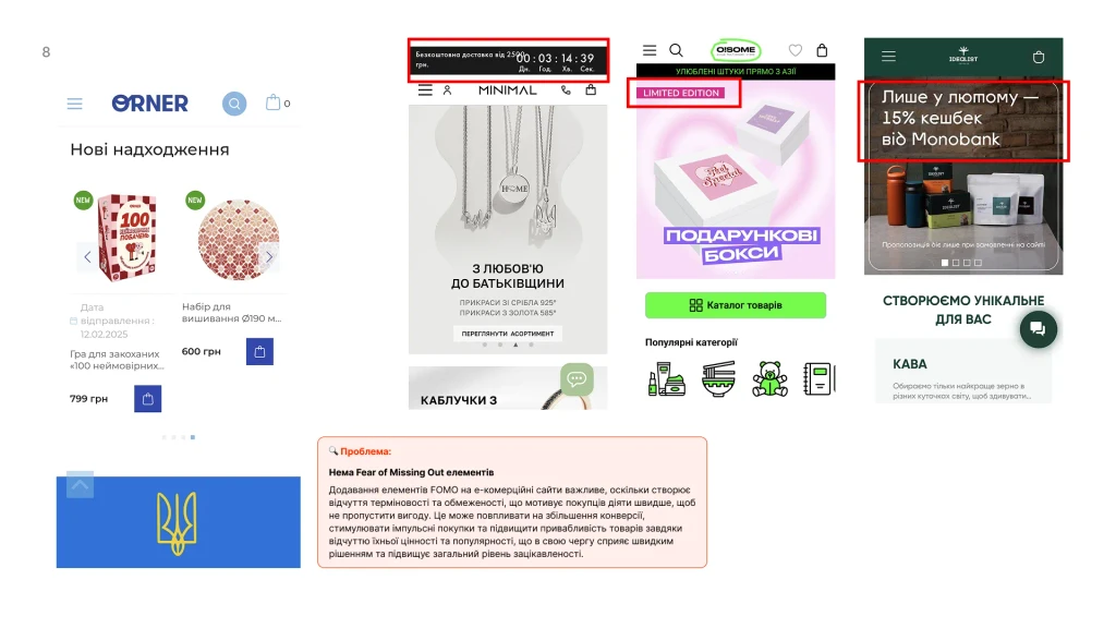
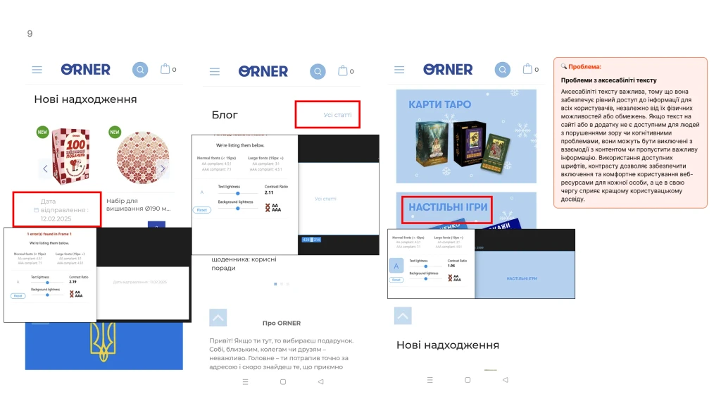
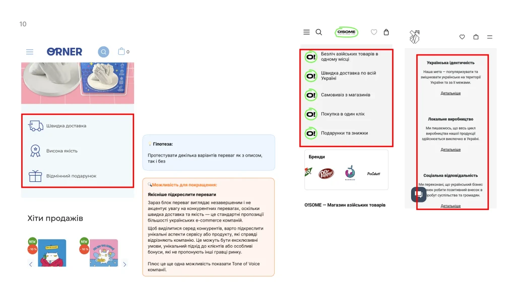
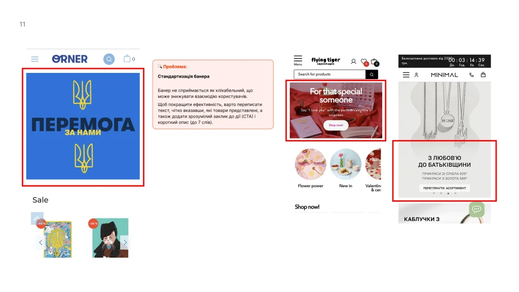
UX Audit:
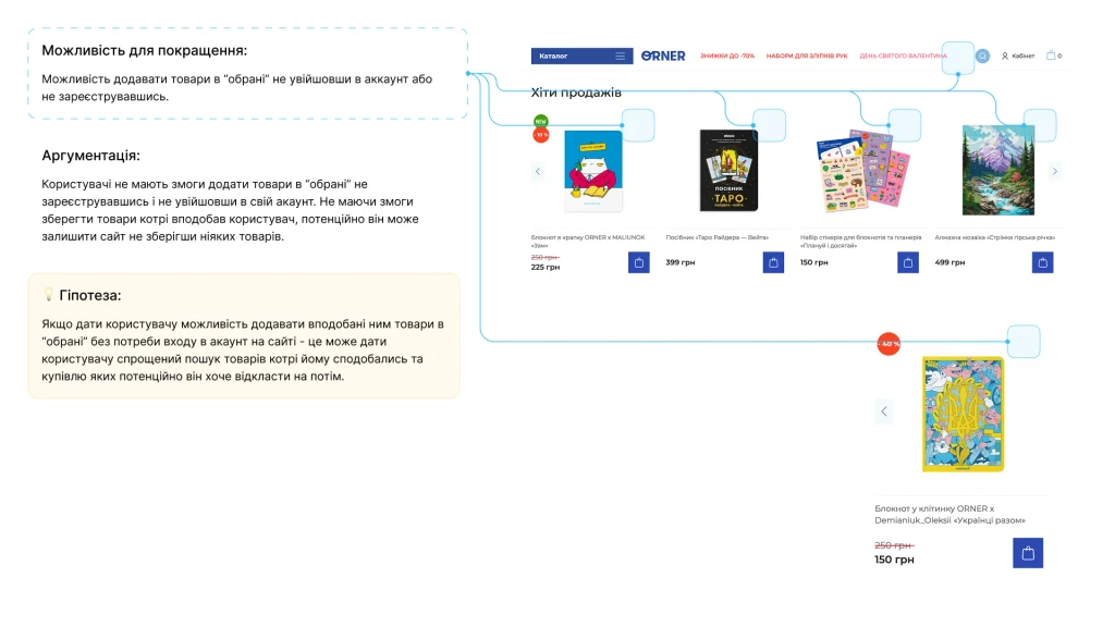
Product
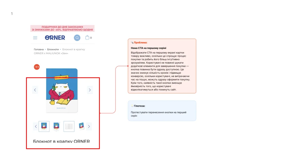
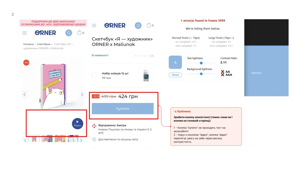
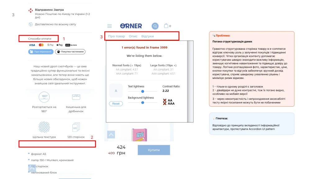
UX Audit:
Product
UX Audit:
Checkout
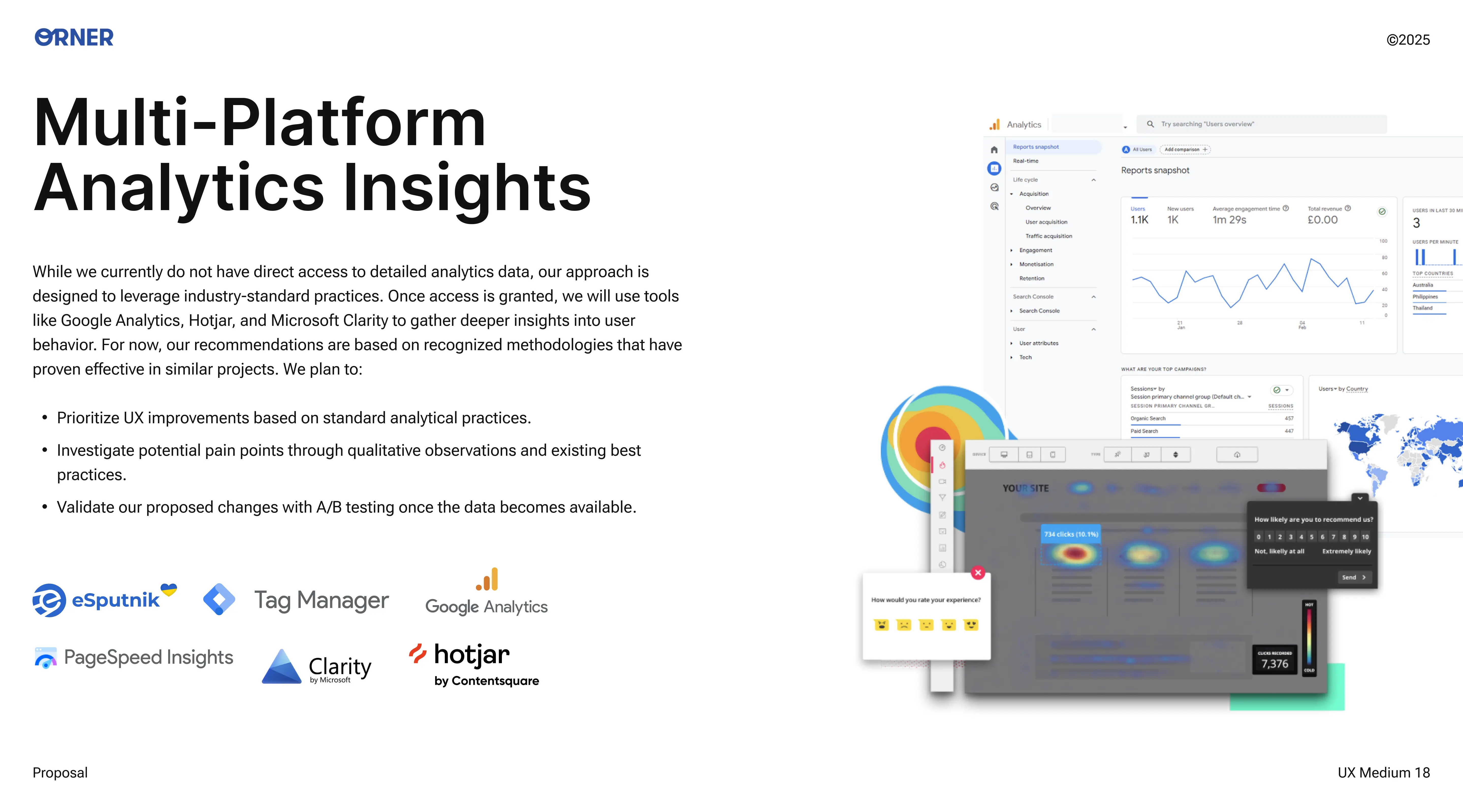
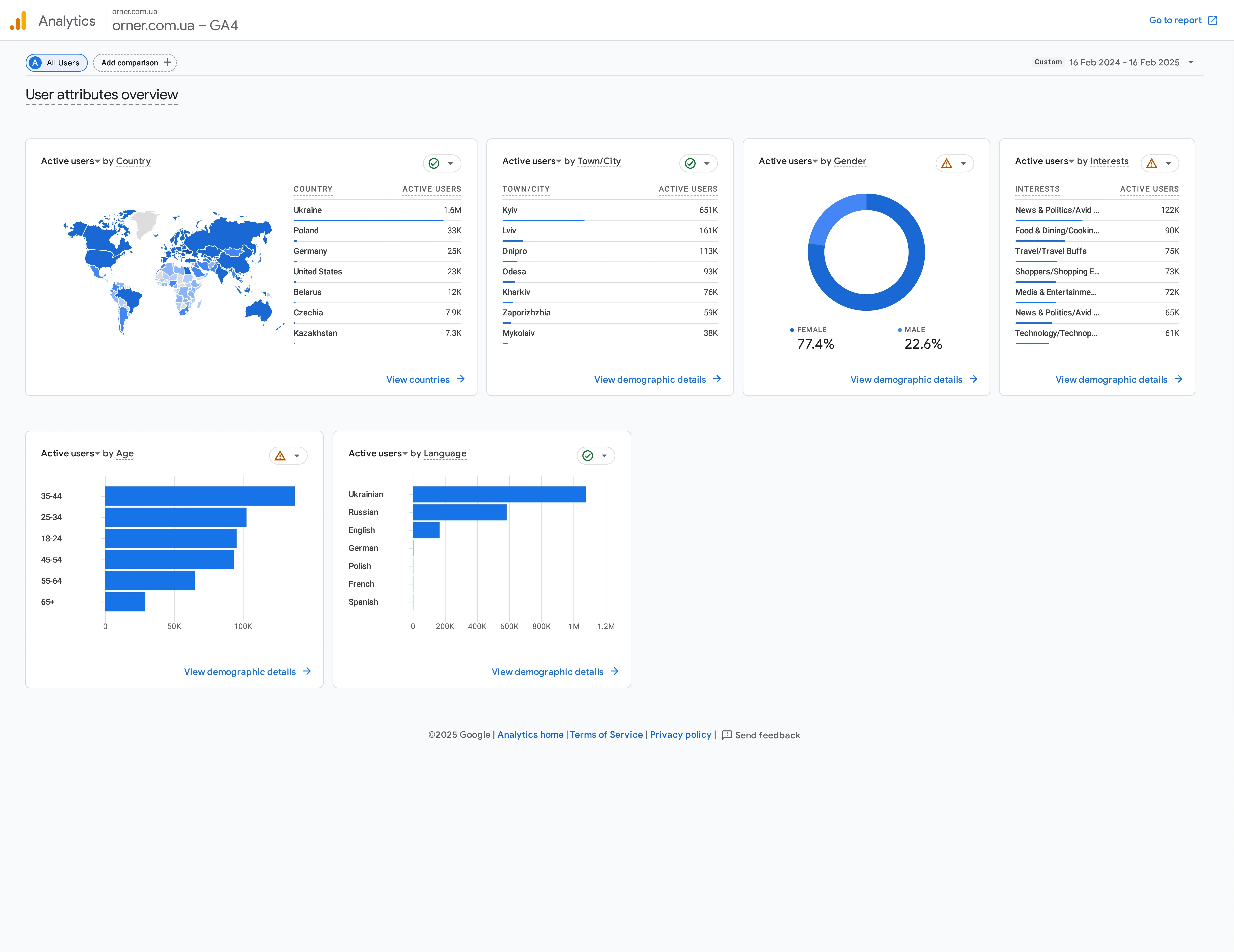
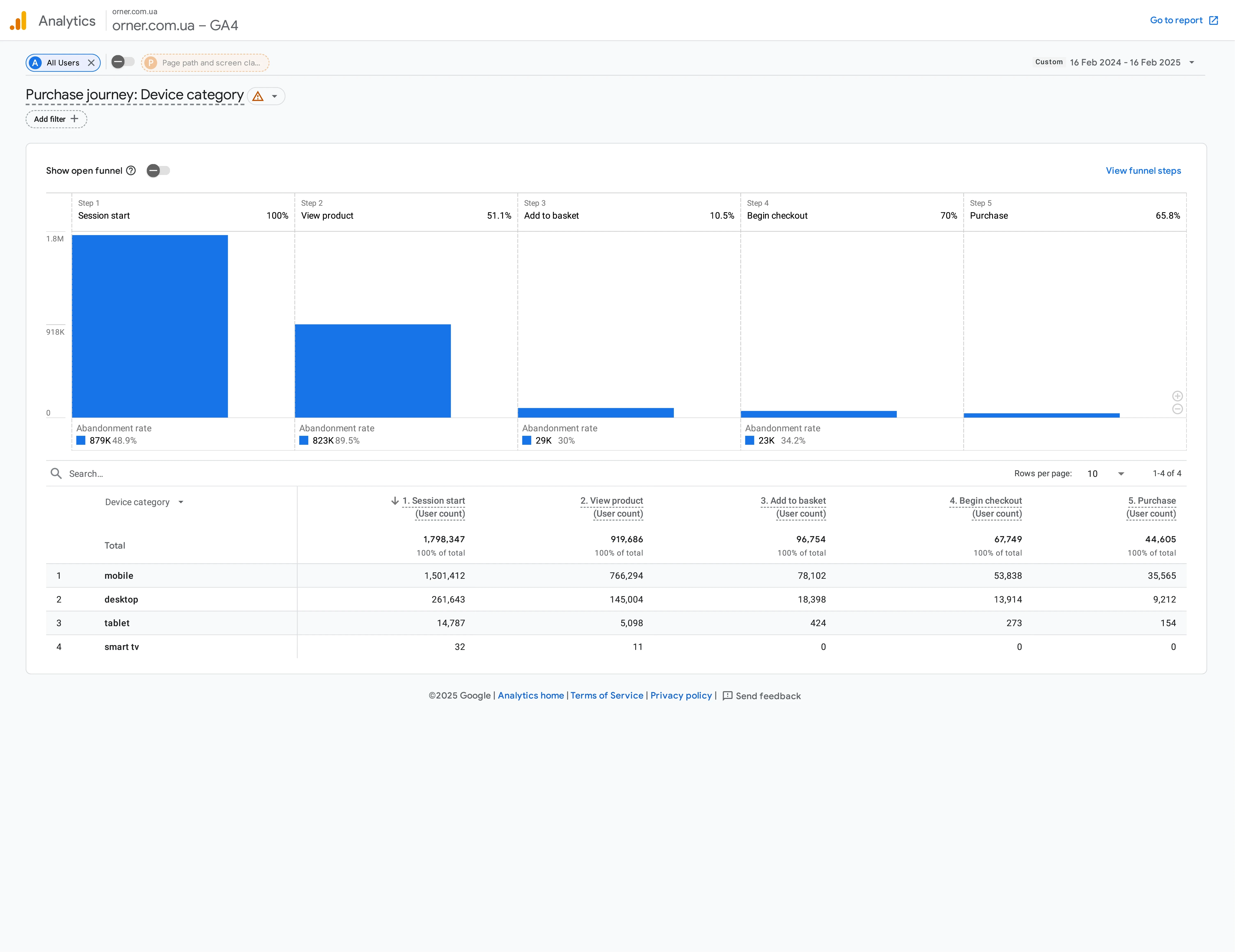
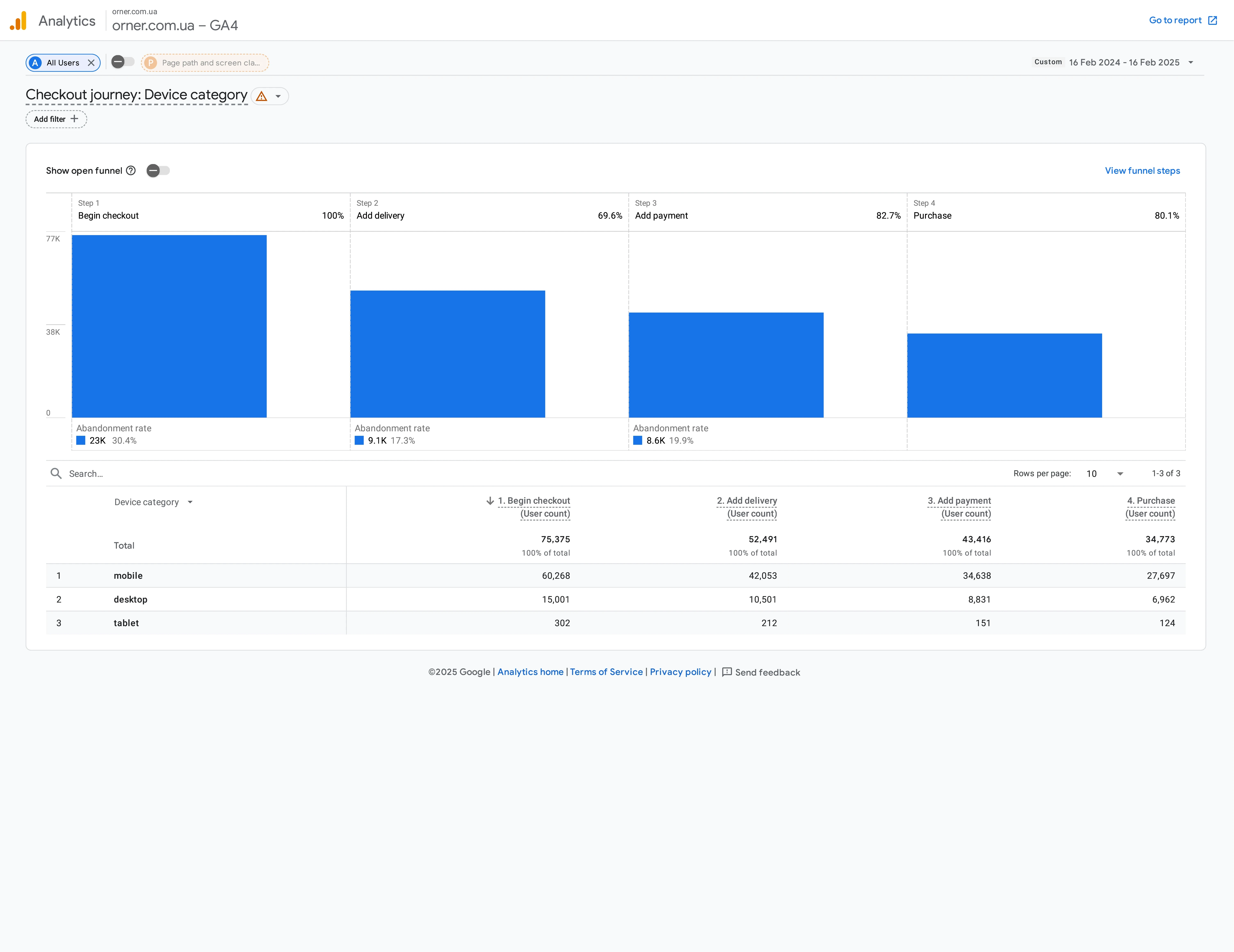
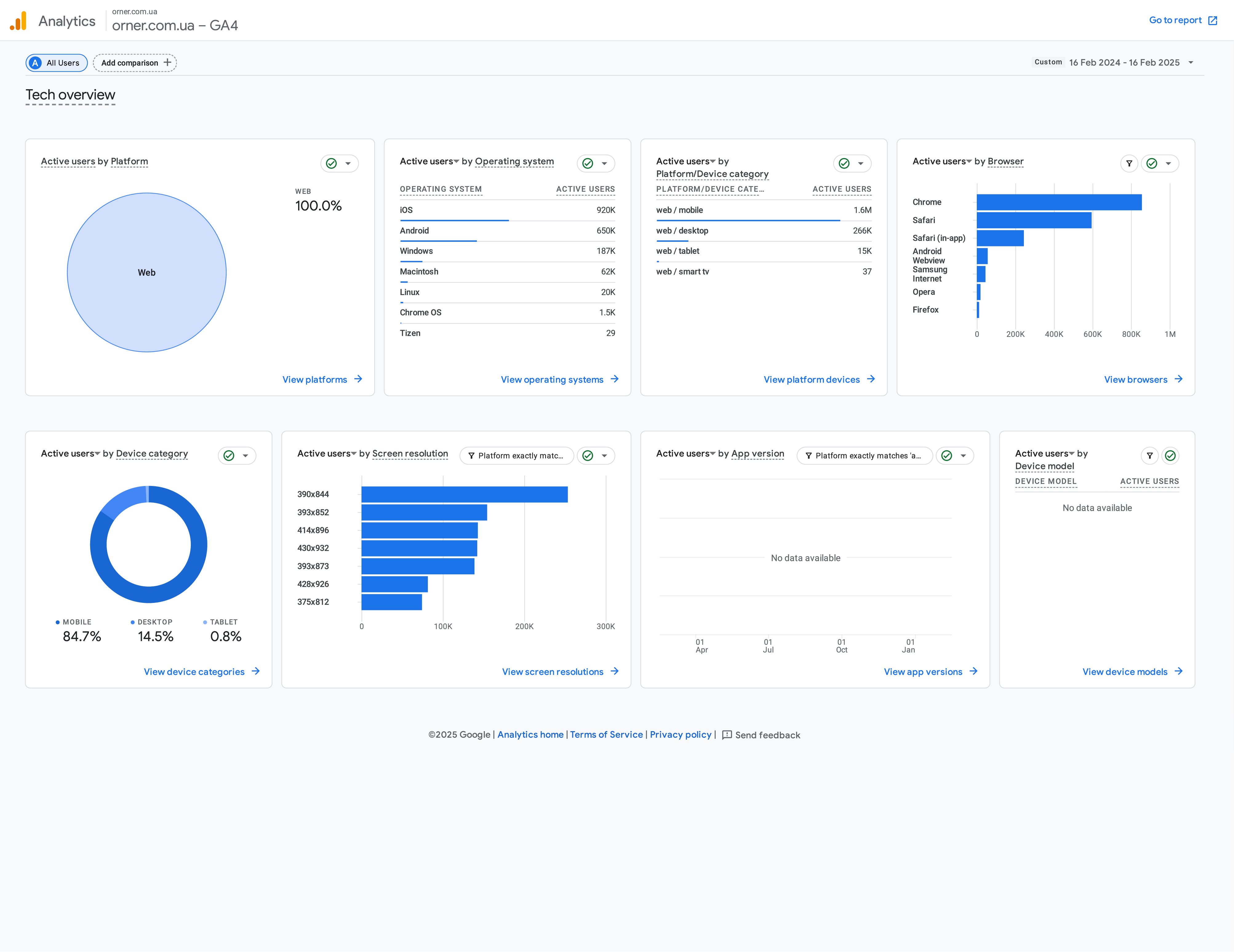
Numbers Don't Lie (Google Analytics Analysis): The client shared their Google Analytics access with us – and it was just what the doctor ordered! The numbers confirmed some of our suspicions:
People were flooding in from search engines, but the conversion rate wasn't great (a Completion Rate of only 12-13%). Something was stopping them.
Categories like "Tarot," "Board Games," and "Sketchbooks" were genuinely sparking interest (lots of views, lots of site searches), but they weren't being added to the cart very often.
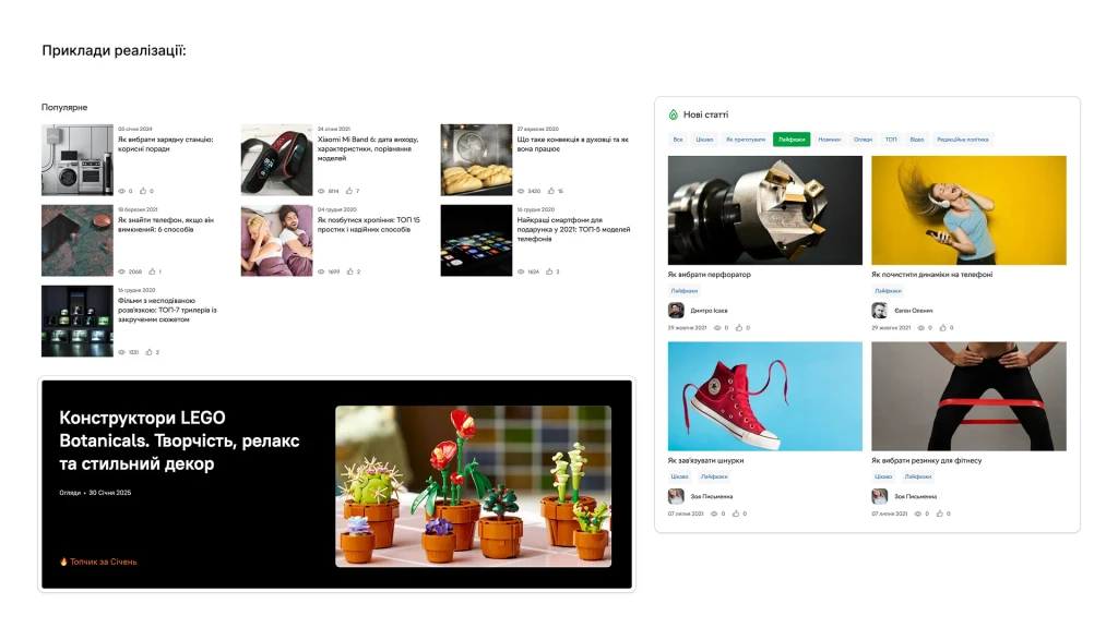
A lot of people came from the blog, but they didn't always buy something afterward. A classic user journey gap!
And mega-important: a whopping 84.5% of users were on mobile! This immediately became our top priority – everything had to be top-notch on a phone.
USER INTERVIEWS & USABILITY TESTING
"So, Can We Talk?"
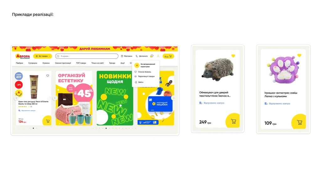
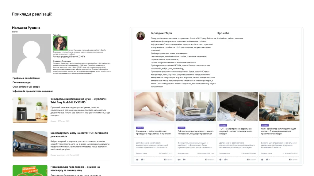
To understand why those board games weren't selling, we talked to people who love and buy them. And the info we got was pure gold! It turned out they need detailed descriptions, rules, photos, videos, and they really, really trust reviews on specialized sites like BoardGameGeek. Then, we asked a couple of people (Alina and Maria) to just click around the Orner site and share their thoughts. It was like seeing our product through a real user's eyes! We saw where they struggled, what annoyed them, and what they actually liked. For example, Alina said, "The huge number of categories makes me think more than I'd like to," and Maria couldn't figure out how to add a product to her "Wishlist." So there you have it!


THE SYNTHESIS
Why Do People Even Need Gifts?
JTBD & Job Stories
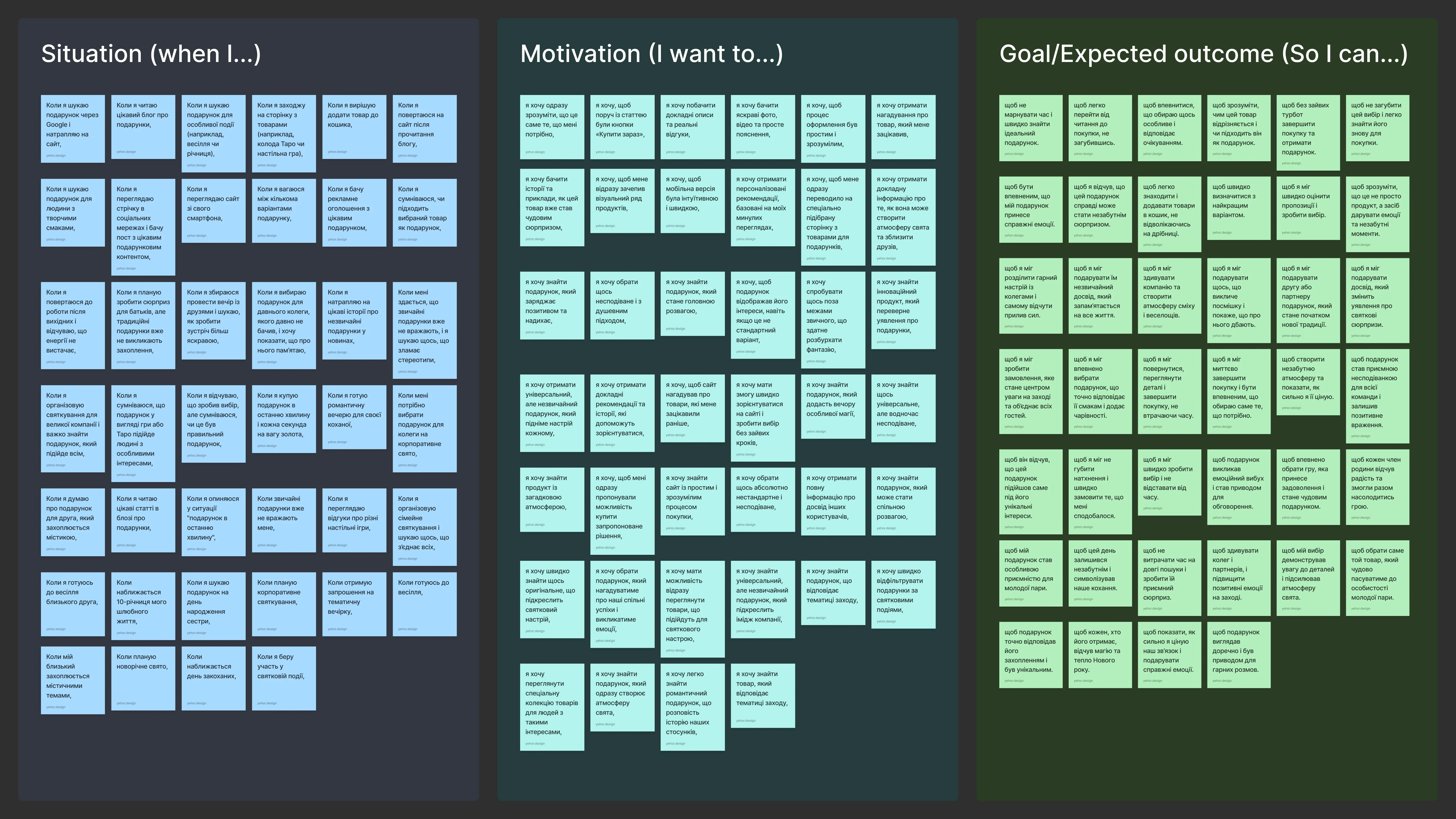
When you have a mountain of information, the main thing is not to drown in it but to organize it all neatly. The Jobs To Be Done (JTBD) framework was a huge help here. We realized that people "hire" Orner for more than just buying some stuff. Their main "job" is "to find a gift that perfectly suits a specific life event, conveys emotions, helps make a celebration unforgettable, and generally, just gets everything right." Can you believe it? That's a completely different mindset! It's not about "just push a product," it's about "helping someone create a celebration"!
To get an even better feel for this, we wrote a few Job Stories—short narratives about what people want in specific situations. For example:

"When it's a loved one's birthday, I want to find a special, heartfelt gift so they feel my care and remember this day."

"When we're getting together with friends for a party, I want to quickly find a cool board game so we can have fun and not be bored."
FOCUSING OUR EFFORTS
"How Might We...?"
HMW Sessions
With this deep understanding, we moved on to the most exciting part – brainstorming! To keep our creativity from flying off in all directions, we framed four key questions in the "How Might We...?" style:
How Might We make it easy for people to find gifts for their specific event or "life moment," instead of just digging through product categories?
How Might We help a person feel confident that the gift they've chosen is the one?
How Might We level up the site search so it understands that a person is looking for a gift for a specific occasion, not just a product by name?
How Might We make it easier for people to go from reading a cool blog post to actually buying something?
Our HMW sessions were a total explosion of ideas! I tried to facilitate the process so that everyone could speak their mind, and we generated a whole mountain of concepts – from tiny tweaks to some pretty bold moves.
How Might We…
THE BIRTH OF SOLUTIONS
Designing with Purpose for Orner
After brainstorming a ton of ideas, it was time to pick the very best ones – those that would genuinely help users and be beneficial for Orner. My job was to make sure that every solution was logical, stemmed from our research, and hit the mark, not just existed "because it looks pretty."
Long story short, here's what we came up with and even built into a prototype:
A New Way to Search for Gifts!
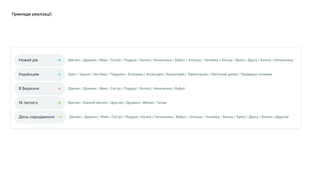
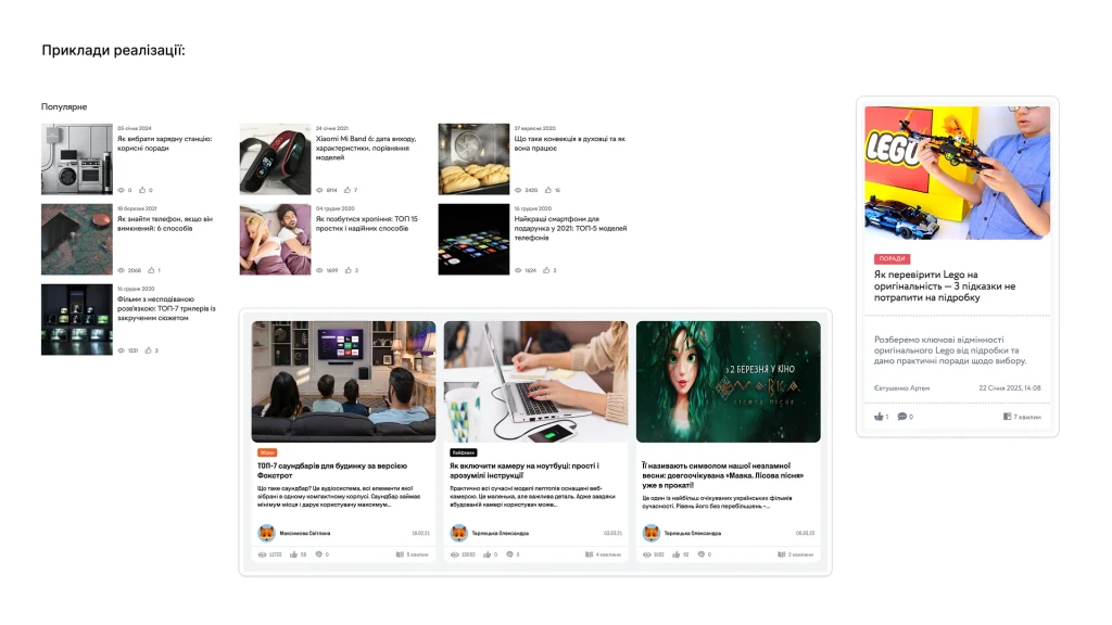
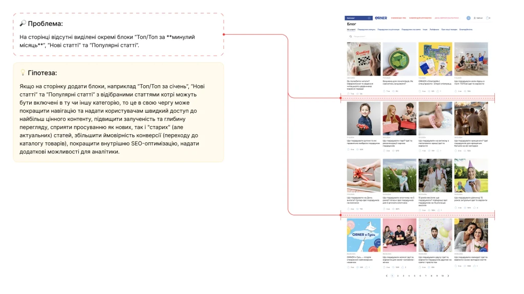
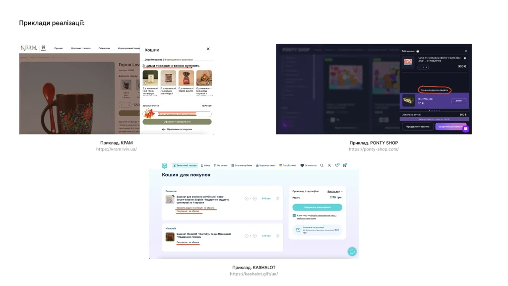
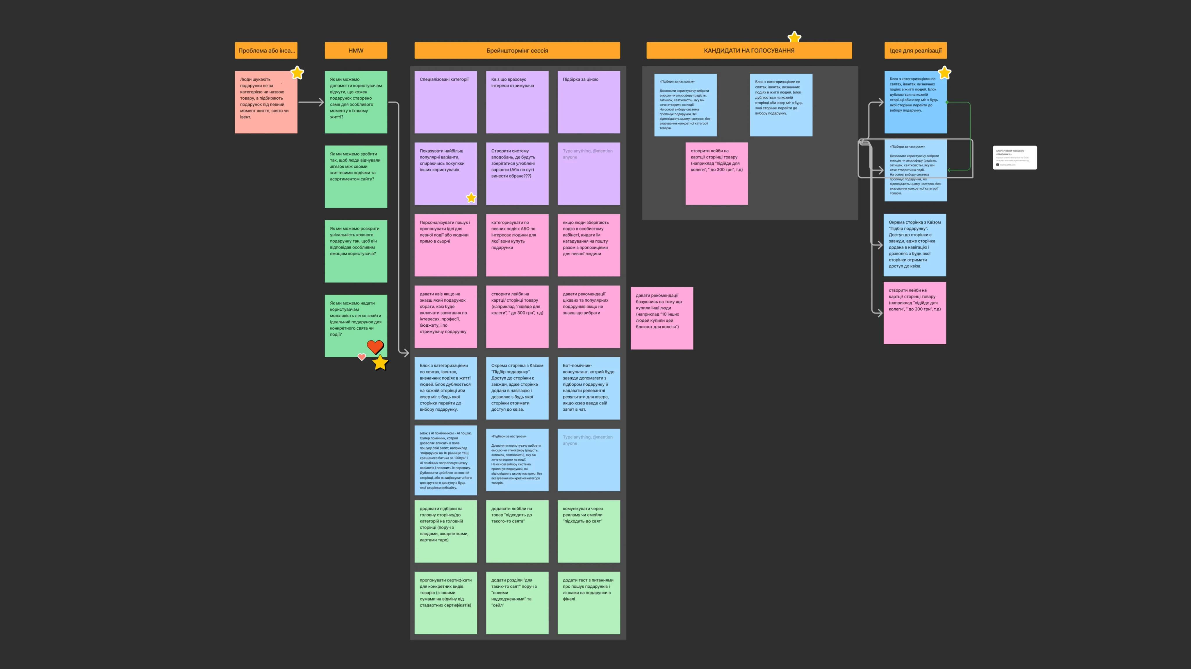
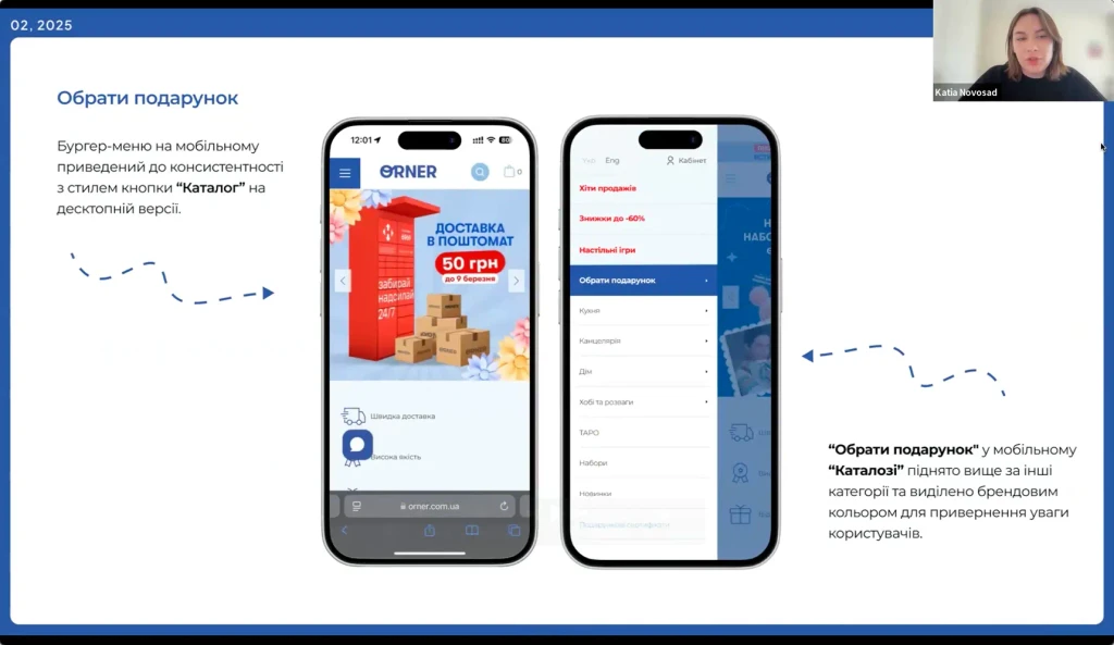
Categories by Events and Holidays: We proposed creating a prominent block (maybe right in the main menu or a visible spot on the homepage) where you could immediately select the event you need a gift for (New Year's, Birthday, Wedding – you get the idea!).
"Shop by Vibe": Now, this is a cool feature! A person chooses the emotion or atmosphere they want to create (like "for a cozy evening," "for a fun group," "pure romance"), and the site suggests suitable products. And it doesn't matter what category they're from!
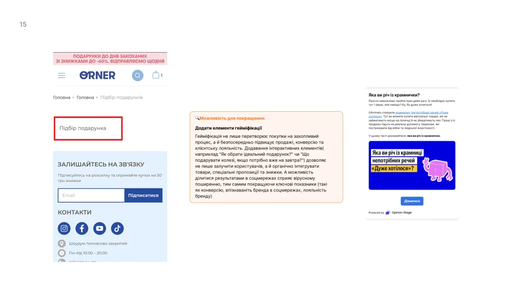
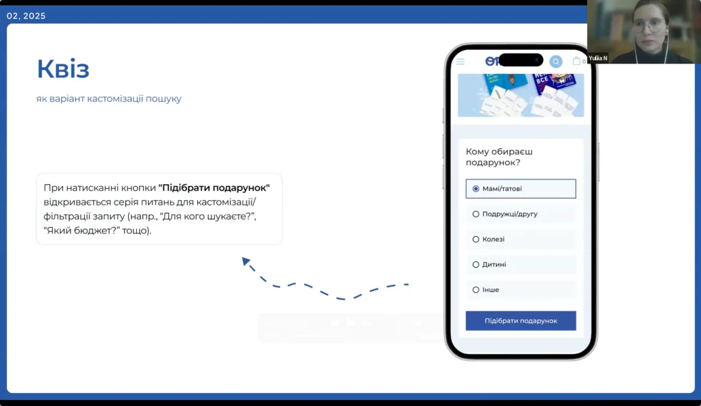
The "Perfect Gift" Quiz: A dedicated helper page. You answer a few simple questions (who's the gift for, what's the occasion, what's the budget) – and get personalized recommendations. Pretty handy, right?
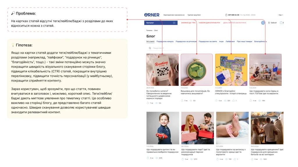
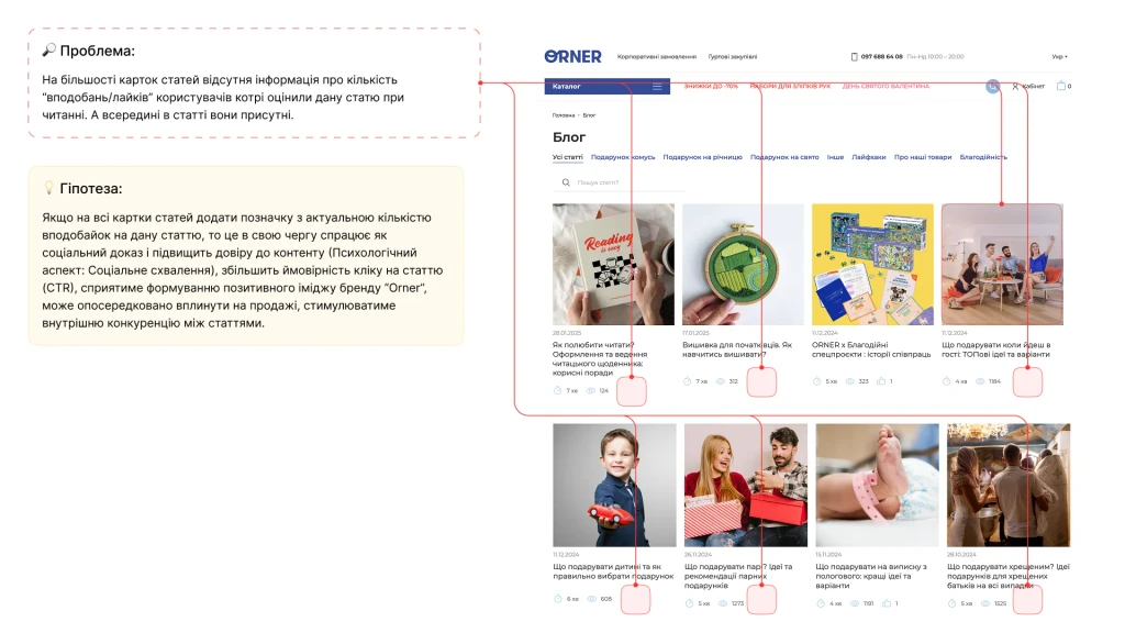
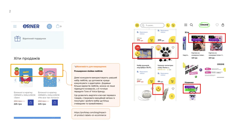
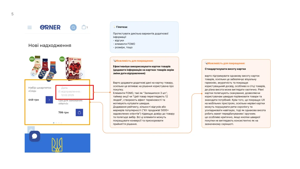
Helpful Labels: Little tags appear on products like "for a colleague," "under 500 UAH," "party hit." It's a small thing, but it helps you get your bearings quickly!
More Confidence in Your Choice!
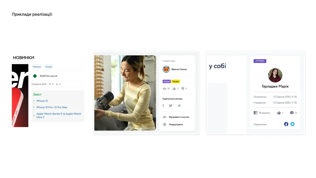
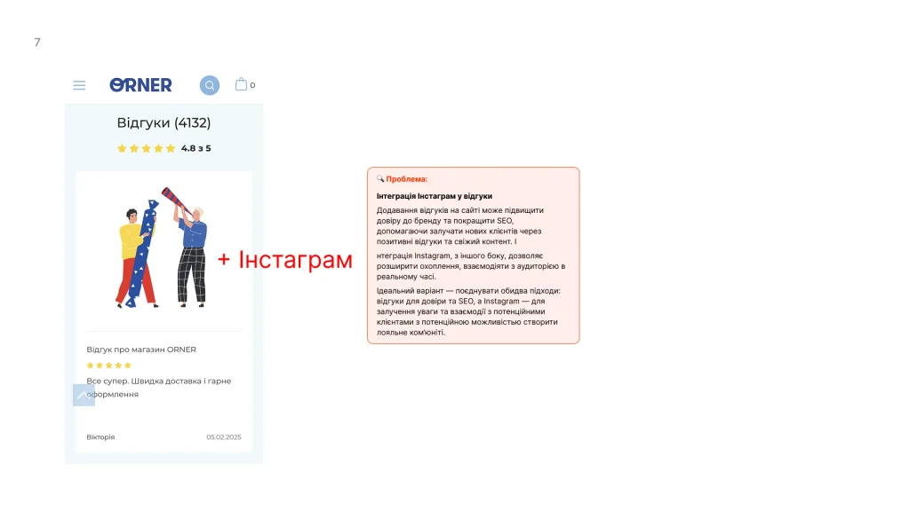
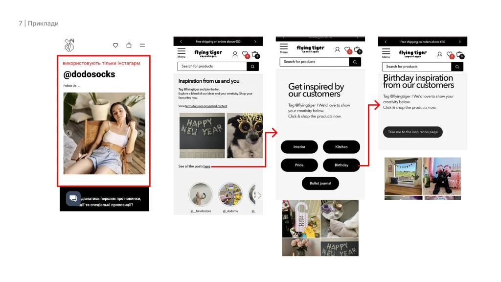
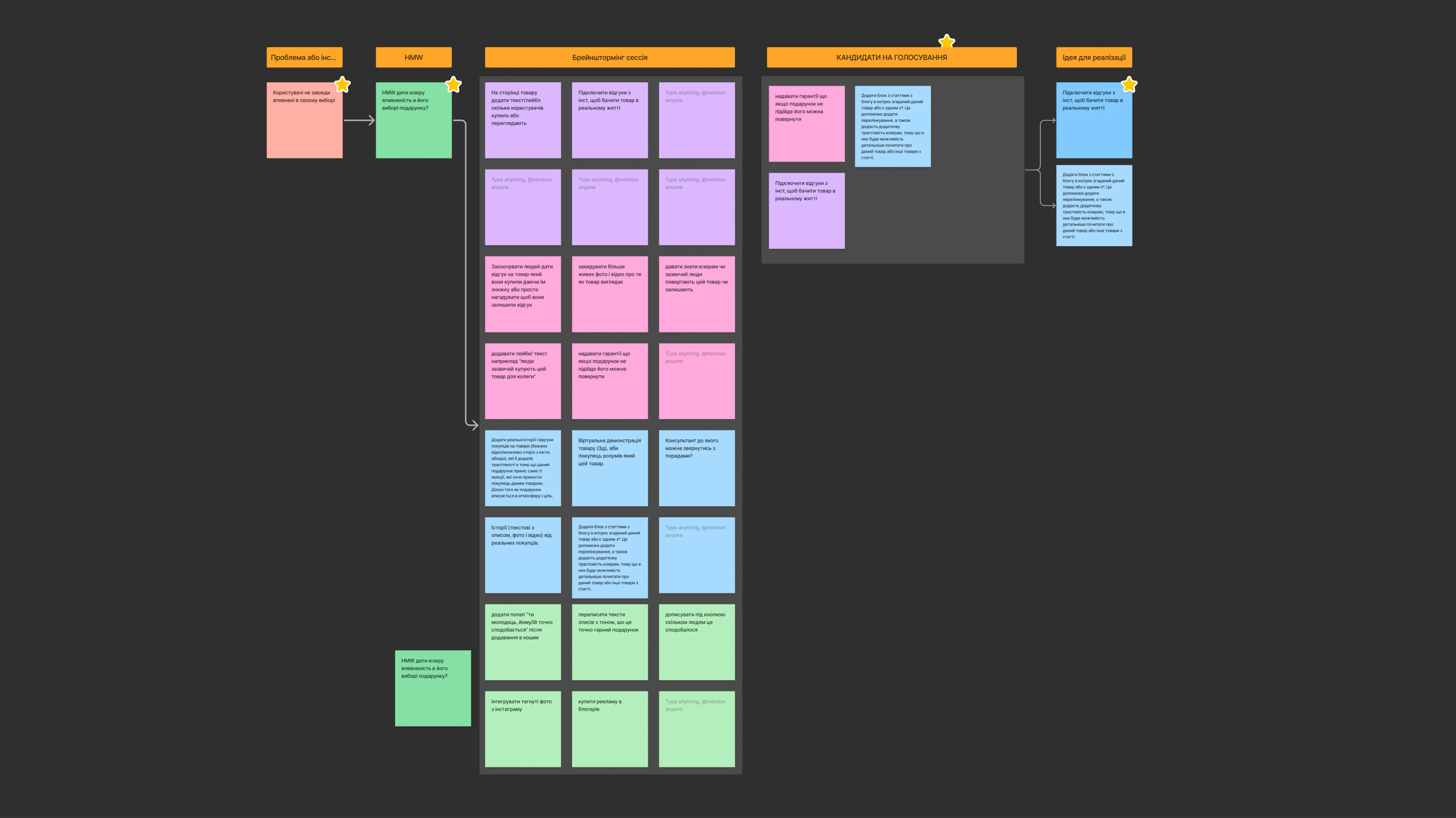
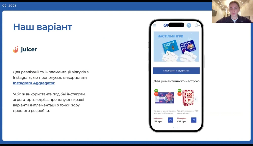
"Real-Life" Reviews from Instagram: We suggested showing photos and reviews from real people from Instagram on the product pages. This immediately shows what the product looks like in real life and builds a lot more trust!
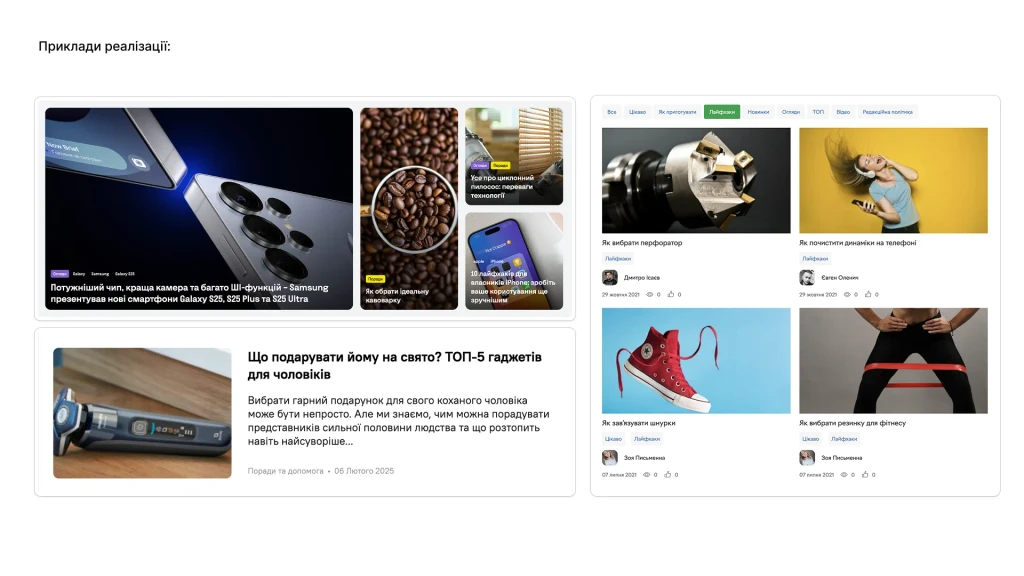
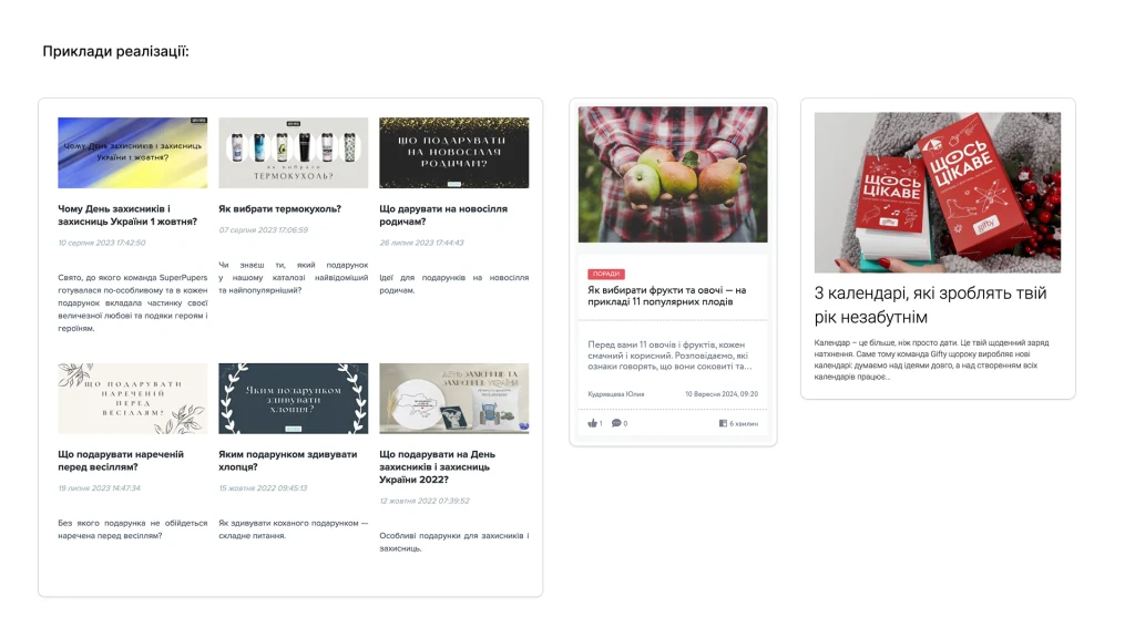
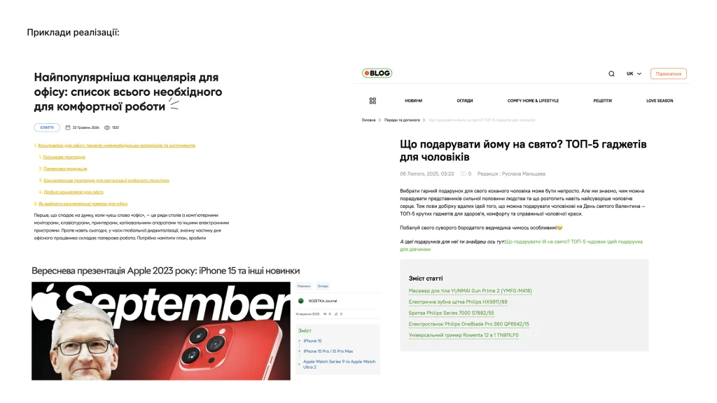
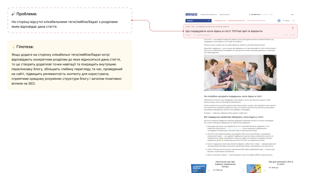
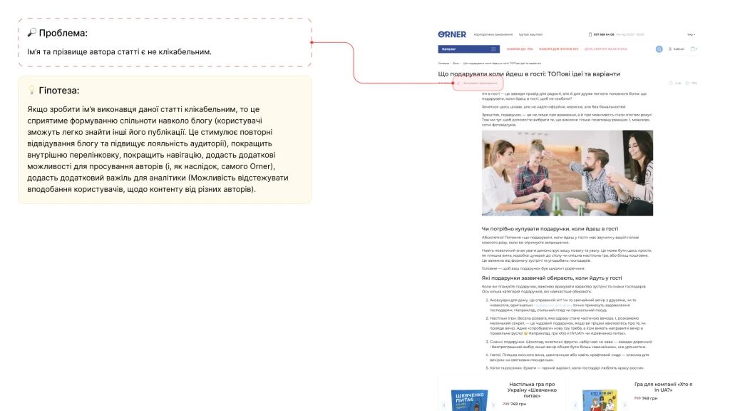
Blog to the Rescue: If there's a great article about a product in the Orner blog, why not show a link to it right on the product page? It's useful and shows that the brand knows its stuff.
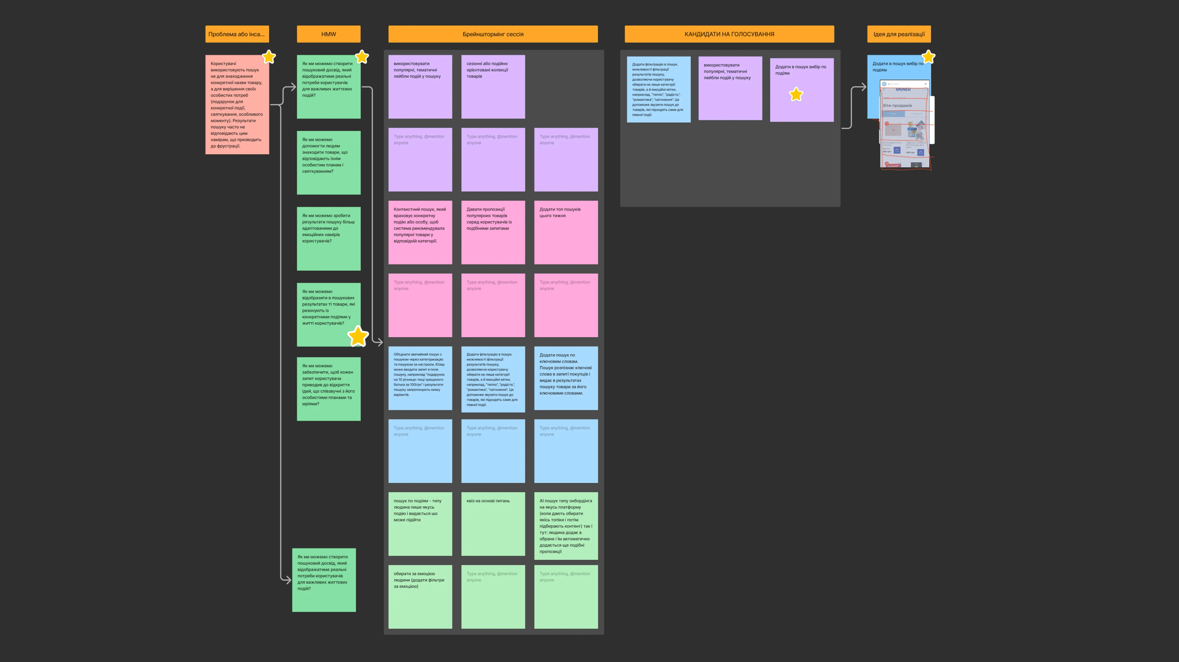
A Smart Search That (Almost) Reads Your Mind:
Search by Event: Now, in the search bar, you could type not just "cup," but "anniversary gift for parents" – and the site would return exactly what you need!
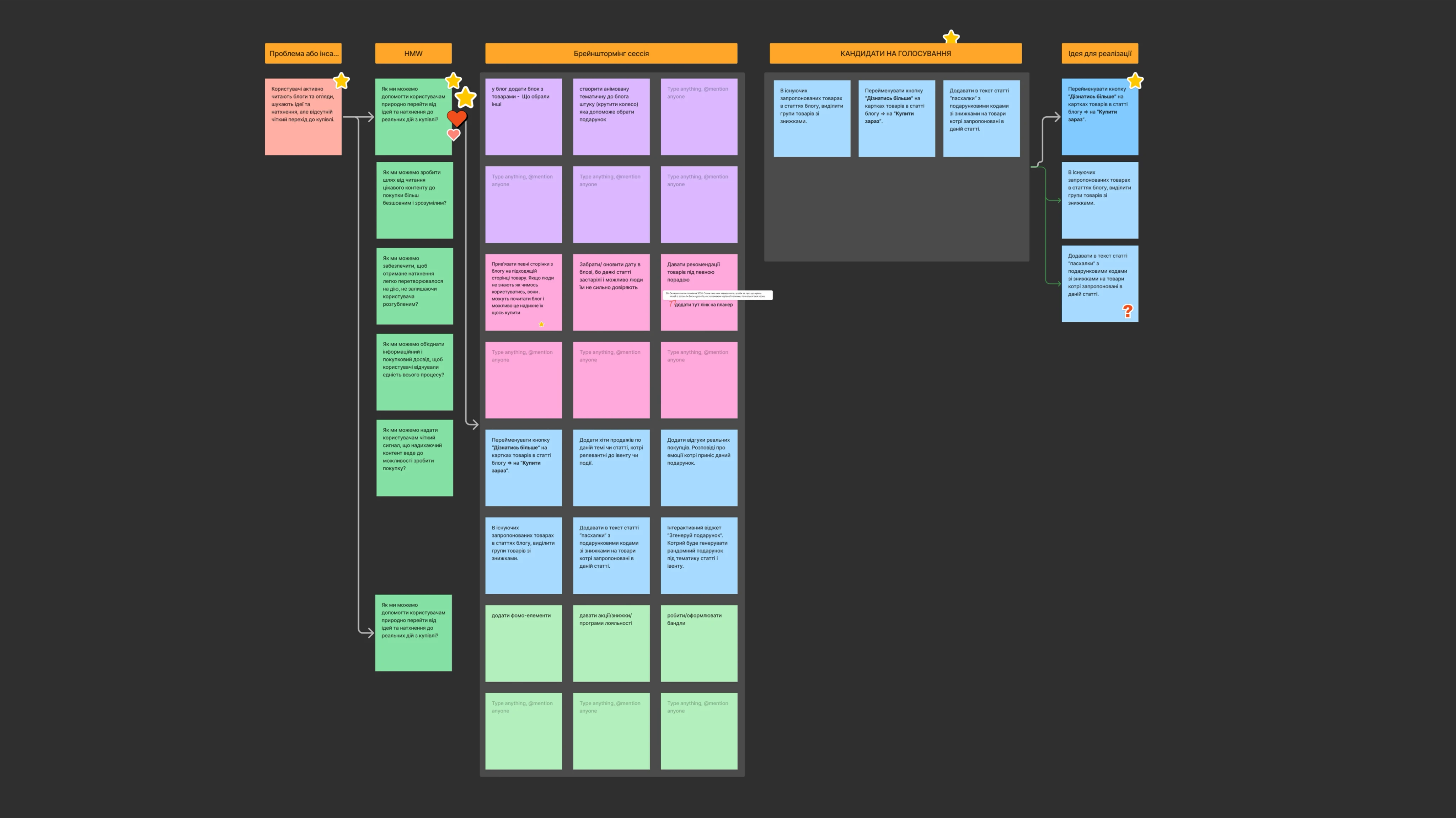
From the Blog – Straight to the Cart, No Stops!
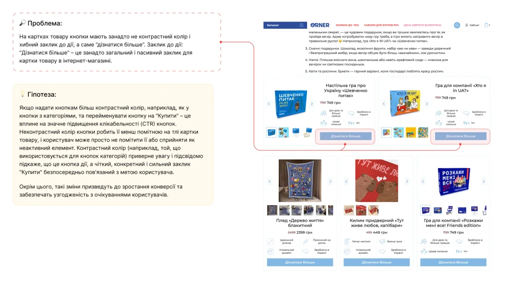
Motivating Buttons: Instead of a boring "Learn More" on products in blog articles, a clear "Buy Now" or "Add to Cart." So they don't have to think twice!
Discounts Front and Center: If an article mentions products on sale, they need to be highlighted so everyone sees them!
"Easter Eggs" for the Most Attentive: And imagine how cool this would be – hiding small promo codes for products from the article right in the text? It would make reading more interesting and encourage a purchase!
THE CLIMAX
Showing Our Work to the Client and Hearing What They Think
And then, the moment of truth – presenting our findings to Vitaliy from Orner. As Team #2, we walked him through everything we'd dug up: how we analyzed sales of board games, Tarot cards, and sketchbooks (since this was a key request!), how we hunted for UX flaws (especially on mobile, where 84.5% of the traffic comes from!), and the cool solutions we came up with. We emphasized that people search for gifts based on specific life moments, not just product names, and that they often lack confidence in their choice.
Vitaliy listened to us very, very attentively, and his reaction was incredibly rewarding! He said we had "a lot of cool ideas" and that he had already "started thinking about how to implement all this." That's the best compliment, isn't it? 😊
Here’s what especially resonated with him from our (Team #2's) proposals:
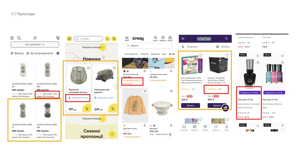
The Labeling System: Vitaliy "literally put an exclamation mark next to this one." He loved the idea of labels like "coming soon" or ones that help users navigate faster. He even mentioned that he'd recently heard in a user study how someone liked the idea of pre-orders because it's a "super novelty, something that's not out yet." And we had just proposed a cool way to highlight that!
Instagram Aggregator for Reviews: "I really liked this idea of yours," Vitaliy said. He agreed that a ton of great user-generated content remains off-site, and it would be awesome to pull it in. The only question was the technical implementation, but the idea itself was a winner!
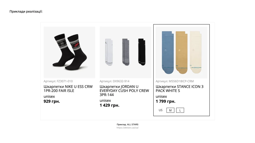
Product Sizes Directly in Categories: Our proposal to show sizes (e.g., for apparel) not just on the product page but also on the main category page also "landed well." Vitaliy said he had been "struggling" with this himself and didn't know how best to do it, and he liked our solution because it was "integrated very beautifully and organically."
CTAs on Banners: Also a plus.
Product Card Structure: Although he thinks their current product card is generally good, he found our idea of how to correctly place focus (e.g., collapsing some info that isn't super important for a specific category) interesting.
Gift-Finder Quiz and Event-Based Categorization: (Although other teams also discussed this, our specific implementation proposals were also noted as logical).
Of course, there were moments that Vitaliy would need to think more about. For example, the idea of a fully open menu instead of a "burger" (all teams mentioned this) – he understands it could be better, but he's afraid that with their constantly growing number of categories, it would quickly turn into chaos. But overall, the feedback was very positive! He stressed that "it's always these little things that I don't pay attention to that really hit home. Or new blocks and feedback appear on points where I had some doubts. And here, there's research, a great presentation, and ideas that often overlap among several teams. And I'm like, 'Okay, that's it, we really need to start moving in that direction.'"
AND WHAT HAPPENED NEXT?
Our Ideas, Brought to Life!
Real-World Feedback
And you know what the coolest part is? Our work didn't just stay on presentation slides! A while later, we found out from our mentor that Vitaliy and Orner actually put some of our ideas into production! And that's just... wow! Here's what they did:
They redesigned the homepage: They added more entry points to categories (hello to our idea about event-based categorization!), made it more interactive, and made the "advantages" block more specific.
UGC content for the masses! They started integrating user-generated content into product cards (remember our idea about reviews from Insta?).
Labels rule! The categories now have labels with product statuses ("coming soon," "expected"), and they also added a label for free or fixed-price shipping. Small things, but they're nice and useful!
It's just incredibly cool to see your work come to life and actually help a business! It's the best motivation to keep moving forward!
MY TAKEAWAYS & KEY LESSONS
What I Learned From This Project
The Orner project wasn't just "another line on the resume." It was a true deep dive into the world of e-commerce, where every button, every picture can influence a person's mood and whether they buy something or not. My previous experience, especially as someone who's already managed design teams, helped me organize the whole thing properly, choose the right research tools, and come up with solutions that weren't just "pretty," but were actually based on what people need.
What I personally took away from this project (besides the experience, of course):
Empathy is everything! Seriously, you can't just look at what people do on a site; you have to try to understand why they do it, what's going on in their heads, what they truly want. It's the key to everything!
Numbers rule! Even small, well-thought-out changes can deliver amazing results, especially if you can show that they're based on research and not just a whim.
You have to align business goals and user needs: A great product is a win-win for both the users and the company. Orner is a perfect example of how making a site more user-friendly can help a business grow without losing its unique charm.
Teamwork is the real deal! Working together, sharing ideas, arguing (constructively, of course!) – you can't do without it. It's a priceless experience when you're not alone but with other equally passionate people.
I'm genuinely proud that we were able to offer Orner such cool, well-thought-out solutions, and I'm even prouder that some of them are already helping them become better! This project proved to me once again how much I love creating things that don't just "work," but also bring people joy and positivity!